Monday, October 30, 2006
Thursday, October 26, 2006
Strong women
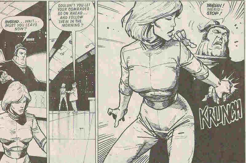 So imagine that the fella with the topknot is Tharg, and Ingrid is all 2000 AD women. Then add the twist that Tharg created these women and made them the way they are. This sequence displays well my feelings about 2000 ADs long and somewhat odd relationship with women. Basically, Tharg wants to use them, but doesn't quite know how to strike the balance between women characters for boys to ogle and charactes for people of bith sexes to identify with, and in the end makes them violent, in keeping with the general 2000 AD fallback ethos. Well, it's a start.
Most of the creators and one assumes most of the readership have been men; the Sci-Fi/Fantasy genre in general has always been thought of as something boys enjoy more than girls. But I've always felt that 2000 AD has tried (relatively hard) to include women, both as characters and as readers. Of course, regarding its characters, it seems right that women should be drawn along the same lines as men, and this seems to be where the difficulties start. By and large, 2000 AD protagonists are prone to violence, wiry rather than hulking, sardonic, self-sufficient and above all, hard. And so it's no surprise that the bulk of 2000 AD women fit this profile, too. But there's perhaps something that doesn't work about this, else why have so few female-centric stories managed to last beyond a series or two? Anderson, Psi has had a good long run and is still going. Halo Jones is perenially revered, although of course she won't be in any new adventures. Tyranny Rex comes and goes, but seems to be mildly re-invented each time. Durham Red - although she's had to have one major re-invention. Is that it? Is it that the readers don't want any more, or is it that the writers aren't inspired by their female creations - perhaps because they feel a bit forced sometimes? Who knows. As I was saying earlier, I do think Tharg tries to be fair about his inclusion of female characters, even if he fails more often than he succeeds. He certainly can't be accused of using simpering, stereotypical damsels in distress; nor indeed are they all outrageously butch men with boobs. Most of them are indeed pretty, but then I'd argue so are the men, so that's not the issue. There have been attempts to feature female-centric strips that keep the 2000 AD 'future shock' mission statement but hold back on the violence, but somehow these haven't quite worked. I mean, Alan Moore tried with Halo Jones but was asked to put more action into books 2 and 3; MoonRunners was, in the end, woefully bad (more on that one day); Zippy Couriers was fun but just didn't seem to be going anywhere - again, though, not clear to me whether this was a lack of excitement on the part of the writer or readers. Poor Tao de Moto ran out of steam, but I think had great potential. I think one area where 2000 AD has let women down is in the aliens/robots department. To be sure, robots ought to be genderless and aliens can be of a whole weird number and kind of gender, but in practice male writers and male artists all too often give a male bent to their non-human characters. And for all his successes with Terri, Pat Mills is probably guilty of the worst woman figure to appear in 2000 AD, sometime ABC Warrior Morrigun. And this mostly because she was essentially flawless, which is unfair given that the whole thing that makes the ABC Warriors a good strip is exploring human flaws in robot characters (with guns). So Morrigun ends up just being eye-candy. Anyway, there is plenty more to say about women in 2000 AD (and indeed about men in 2000 AD, who also have their stereoptypes). Pat Mills' approach in Slaine, for example. Why Judge Anderson works as a character so well. Which artists draw the best-looking babes... But for now, here's a short montage of some lesser-known women doing what 2000 AD does best...
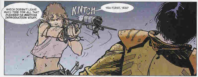 Getting its guns out
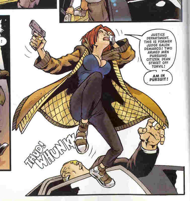 Kicking people in the head while giving them something to stare at
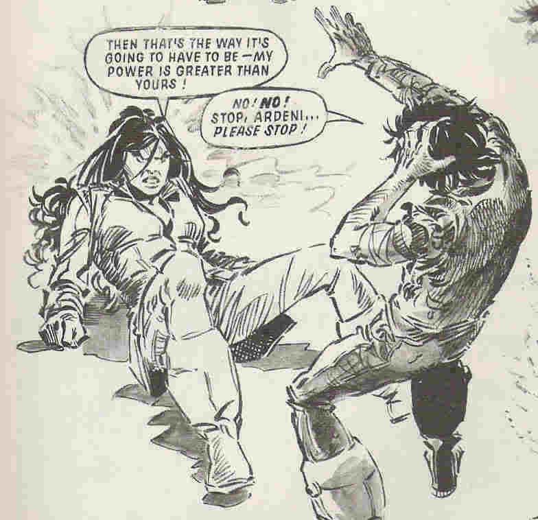 Pointing out yet agian that women are stronger than men (I suppose this can't be said too often)
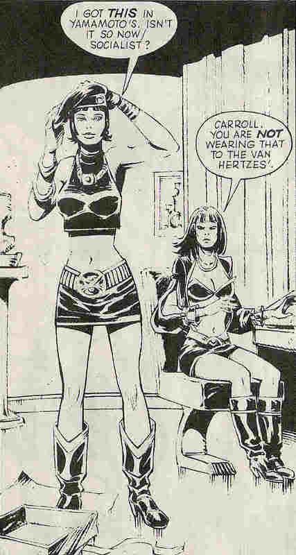 Bringing you the latest in future fashions. I sad MoonRunners was bad, didn't I? Although this is a very endearing panel. I'm glad it had its time in the comic, I'm just sad that the story didn't live up to its characters.
Sunday, October 22, 2006
Random Prog Review
For a change, let's pick out a single issue and see what we can learn from it.
I give you...
Prog 862

Before we begin, some background context. 2000 A.D. in the early 90s was perhaps reaching the end of its 'seriously hip' phase. A few years earlier it became fashionable to read and talk about comics for adults, which apparently was a novelty (frankly, I've always thought comics were for people of any age, but hey ho). 2000 A.D. had been part of that, mostly because it featured writers and artists who didn't dumb down their stories the way that overt children's comics often did. This was in part due to the second generation of creators to work on the comic, who were becoming old hands by 1993, and most were on the verge of making it big in the USA. Despite the presence of Grant Morrison, Garth Ennis, Dermot Power, Chris Weston et al, I suspect that 2000 AD was still seen by and large as a children's comic, as it certainly had been when it began in 1977.
Anyway, by the time it was 1993, this child/adult readership thing was becoming a little weird. Prog 862 came along just a couple of months after the still-famous 'Summer Offensive' took place - an 8-Prog experiment in which Morrison with some help from Mark Millar took over as editors of 2000 AD, seemingly with a mission statement of making the comic ultra-hip. I might attempt to dissect that experiment some time in the future. Extra context: I was 15 when I first read this Prog.
Hangovers from the Offensive were evident in Prog 862's first strip, Judge Dredd: Book of the Dead (part 4)
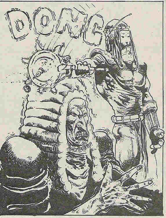
Written by Morrison and Millar, painted art by Power. (Lettered, curiously, by John Aldrich - not Dredd stalwart Tom Frame. Was Frame just on holiday, or was he making a statement about quality?) This story was and remains pretty poor. Dredd is visiting the Judges in Luxor, the Egyptian Mega-City. An evil undead monster fights him. That's it, but it's still an 8-episode mini-epic. It's actually a pretty good comic for displaying the level of understanding that these two writers had for the character and world of Dredd. Basically, that he is extrememly hard, and extremely unsympathetic. And frankly, that's not good enough. I can see that they were trying to write crowd-pleasing stuff by showing Dredd sneering a lot, coming up with one-liners and hurting people, but it's relentless, and all too often not very funny. (they did get the comedy hardness right every now and then, so it wasn't all bad) Now, Dredd has always functioned as a satire about heavy-handed policing, which I'm sure M&M enjoyed playing up, but I can't say I remember 1993 as being a bad time for civil rights in the UK, especially compared to today. Ultimately, this era of Dredd is memorable for the story and the art; the former for being so bad, the latter for being disproportionately good.
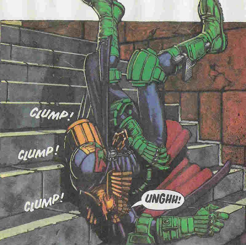 Back to the review. Dredd goes on a tour of Luxor's Resyk facility, watches the recently murdered chief judge get mummified, then falls down the stairs. Great art, and in fact this episode has some fun moments, but overall, not the stuff of legend.
In honour of Dave Campbell's excellent 'Long Box' blog, I will from time to time present my wn 2000 AD 'the pain' awards. But only when a series, episode or panel really deserve it. Like 'Book of the Dead'.
Verdict:
Tharg's Future Shocks: A Kind of Hush
Written by Peter Hogan, drawn by John Haward
Three pages (often a decent Shock doesn't need the full five), a simple story, and essentially harmless. One of those, 'oh, yes, clever idea' ones, not one to blow you away. Haward draws in a nicely detailed style, but it feels very childish next to the painted Power. More on Hogan later...
Verdict: >shrug<>
Mean Arena episode 11
Written by Alan McKenzie drawn by Anthony Williams. That's to say, you can recognize McKenzie's style, but it seems to me that he was trying to copy Mark Millar. Professional jealousy, perhaps? Millar may not be fondly remembered these days, but he was given a lot of work by Tharg at one point, so he must have been doing something right. I wonder if McKenzie thought he would try the same thing as Millar, only do it right. So, instead of taking an old favourite 2000 AD character and making them ultra-violent and ultra-stupid (as Millar did with my beloved Sam Slade), he would take an old not-so favourite series, but give it a new set-up and new characters. And then make them ultra-violent and ultra-silly (actually a bit like Mike Fleischer did with Harlem Heroes, come to think of it).
Basically, Mean Arena is a bit rubbish. Future Sports stories are tricky, and reducing them to a series of fight scenes isn't the answer. Nor is giving them a bland hero figure.
The Mean Arena reboot is interesting from a social history point of view, in that it reads and is drawn remarkably like a classic British children's comic. It sums up nicely the desire to attract new young readers who might be a bit overwhelmed by Power's Dredd, or scared by Chris Weston. Yet by making the story a re-vamp of a strip from the early 80s it's surely also trying to appeal to older readers. Weird. That said, I remember enjoying it at the time, not least because it felt accessible, unlike the recent spate of Morrison pretensions. But time has not been kind to the series, especially since Williams has since improved as an artist. Sure, he's plaenty fun and dynamic here, but it's a bit simplistic compared to his deeply atmospheric VCs work.
This penultimate episode sees the 'super-brawl' in mid-flow; basically, all the characters are smacking the stomm out of each other. In the background, one media company is taking over another medai company (why oh why are all 2000 AD future sports serieses about manager and media shenanigans?).
Verdict: this scene of some loser fallinf foul of a booby trap from epsiode 11 functions nicely as a built-in 'the pain' image:
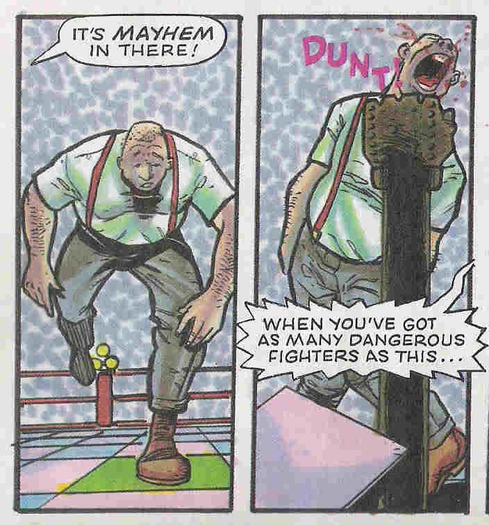 (no, not the text, the idiot being smacked in the chin)
Luckily, the quality takes a leap next, with Canon Fodder episode 2
Written by Mark Millar, loving drawn by Chris Weston. Easily the best thing Millar ever did for the comic, although without Weston's way-out imagination and downright nastiness, it wouldn't stick in the mind nearly so much. We learn in this episode that the series is set in the time of Judgement. All the dead have risen, and are awaiting God's final verdict. Except God never shows up, and all those people are left with a massive overpopulation problem. Inexplicably, the Victorian era dead end up in charge, and in order to keep the people in check, not to mention reverential, a 'priest patrol' has been set up. Canon Fodder is the Judge Dredd of the priest patrol. For what it's worth, he seems to be Church of England.
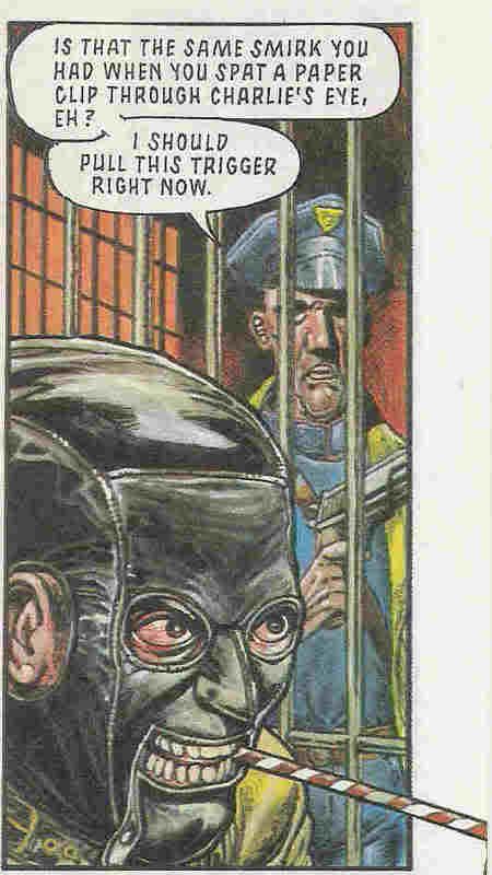
We also meet Mycroft Holmes, older and nasty brother of Sherlock, whom the Canon recruits to aid in his quest. To be sure, the trademark MIllar silliness and inexplicable violence is still present, but the overall concept and characters lift the tale.
Verdict: Worthy of a reprint
Strontium Dogs: The Darkest Star episode 8
Written by Garth Ennis, drawn by Nigel Dobbyn
In which Johnny Alpha is killed for the second time. But, you know, it works, and it remains a genuinely poignant moment for me. Although I have to admit that back when I was 15 I was secretly hoping that they'd resurrect the man. It's best they didn't really.
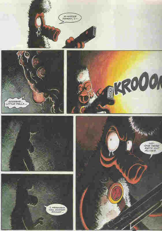 Ennis really went in at the deep end in 2000 AD, taking over from the mighty Wagner on Dredd, Chopper and Strontium Dog(s). He's good, but in these cases not as good as big John W. I think perhaps his humour was a bit too broad in comparison, and, not unlike Millar, his violence was a bit too over the top at times. Still, his efforts with Feral were decent enough, especially with the right artist (i.e. Steve Pugh, not Dobbyn). The Darkest Star suffers from being a bit too much of a continuity piece, trying to piece together the aftermath of 'the Final Solution'. If Alpha had been a US superhero, it would fit right in...
In the end, there are fun moments, and Dobbyn has a great way with emotions, even if his art is just too friendly to draw a mean Feral, let alone a tribe of evil necromancers.
Verdict: solid
Finally, episode 3 of Timehouse
Written by Peter Hogan, lovingly drawn by Tim Bollard
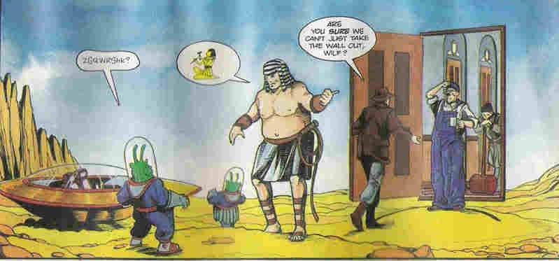 Just look at that. Beautiful, no? Well, I like it, and was sad not to see Tim Bollard outlast Timehouse, which enjoyed just two outings. It is perhaps the single least congruous series to appear in 2000 AD. Clearly something that would have been at home in a Sci-Fi comic aimed at younger, less violent children (would that such a comic existed), it was nevertheless for me a breath of fresh air in the comic. Given all the extreme hardness and casual murder prevalent in most strips for so long, it felt right to me to be able to read the harmless and mildly hapless misadventures of the Time Family. Not unlike a Carl Barks Donald Duck story in many ways - i.e. clever, funny and charming, even if it's rather lacking in the future shock factor integral to the galaxy's greatest. Poor old Peter Hogan arrived at 2000 AD at exactly the right time from my point of view, but I guess at the wrong time in terms of the zeitgeist. Luckily he would go on to find a suitable home with Alan Moore's ABC line. Likewise Bollard, who would've drawn a fun Dredd, but not one written by Millar...
Verdict: read it again, all ye naysayers.

I give you...
Prog 862

Before we begin, some background context. 2000 A.D. in the early 90s was perhaps reaching the end of its 'seriously hip' phase. A few years earlier it became fashionable to read and talk about comics for adults, which apparently was a novelty (frankly, I've always thought comics were for people of any age, but hey ho). 2000 A.D. had been part of that, mostly because it featured writers and artists who didn't dumb down their stories the way that overt children's comics often did. This was in part due to the second generation of creators to work on the comic, who were becoming old hands by 1993, and most were on the verge of making it big in the USA. Despite the presence of Grant Morrison, Garth Ennis, Dermot Power, Chris Weston et al, I suspect that 2000 AD was still seen by and large as a children's comic, as it certainly had been when it began in 1977.
Anyway, by the time it was 1993, this child/adult readership thing was becoming a little weird. Prog 862 came along just a couple of months after the still-famous 'Summer Offensive' took place - an 8-Prog experiment in which Morrison with some help from Mark Millar took over as editors of 2000 AD, seemingly with a mission statement of making the comic ultra-hip. I might attempt to dissect that experiment some time in the future. Extra context: I was 15 when I first read this Prog.
Hangovers from the Offensive were evident in Prog 862's first strip, Judge Dredd: Book of the Dead (part 4)
Written by Morrison and Millar, painted art by Power. (Lettered, curiously, by John Aldrich - not Dredd stalwart Tom Frame. Was Frame just on holiday, or was he making a statement about quality?) This story was and remains pretty poor. Dredd is visiting the Judges in Luxor, the Egyptian Mega-City. An evil undead monster fights him. That's it, but it's still an 8-episode mini-epic. It's actually a pretty good comic for displaying the level of understanding that these two writers had for the character and world of Dredd. Basically, that he is extrememly hard, and extremely unsympathetic. And frankly, that's not good enough. I can see that they were trying to write crowd-pleasing stuff by showing Dredd sneering a lot, coming up with one-liners and hurting people, but it's relentless, and all too often not very funny. (they did get the comedy hardness right every now and then, so it wasn't all bad) Now, Dredd has always functioned as a satire about heavy-handed policing, which I'm sure M&M enjoyed playing up, but I can't say I remember 1993 as being a bad time for civil rights in the UK, especially compared to today. Ultimately, this era of Dredd is memorable for the story and the art; the former for being so bad, the latter for being disproportionately good.
 Back to the review. Dredd goes on a tour of Luxor's Resyk facility, watches the recently murdered chief judge get mummified, then falls down the stairs. Great art, and in fact this episode has some fun moments, but overall, not the stuff of legend.
In honour of Dave Campbell's excellent 'Long Box' blog, I will from time to time present my wn 2000 AD 'the pain' awards. But only when a series, episode or panel really deserve it. Like 'Book of the Dead'.
Verdict:

Tharg's Future Shocks: A Kind of Hush
Written by Peter Hogan, drawn by John Haward
Three pages (often a decent Shock doesn't need the full five), a simple story, and essentially harmless. One of those, 'oh, yes, clever idea' ones, not one to blow you away. Haward draws in a nicely detailed style, but it feels very childish next to the painted Power. More on Hogan later...
Verdict: >shrug<>
Mean Arena episode 11
Written by Alan McKenzie drawn by Anthony Williams. That's to say, you can recognize McKenzie's style, but it seems to me that he was trying to copy Mark Millar. Professional jealousy, perhaps? Millar may not be fondly remembered these days, but he was given a lot of work by Tharg at one point, so he must have been doing something right. I wonder if McKenzie thought he would try the same thing as Millar, only do it right. So, instead of taking an old favourite 2000 AD character and making them ultra-violent and ultra-stupid (as Millar did with my beloved Sam Slade), he would take an old not-so favourite series, but give it a new set-up and new characters. And then make them ultra-violent and ultra-silly (actually a bit like Mike Fleischer did with Harlem Heroes, come to think of it).
Basically, Mean Arena is a bit rubbish. Future Sports stories are tricky, and reducing them to a series of fight scenes isn't the answer. Nor is giving them a bland hero figure.
The Mean Arena reboot is interesting from a social history point of view, in that it reads and is drawn remarkably like a classic British children's comic. It sums up nicely the desire to attract new young readers who might be a bit overwhelmed by Power's Dredd, or scared by Chris Weston. Yet by making the story a re-vamp of a strip from the early 80s it's surely also trying to appeal to older readers. Weird. That said, I remember enjoying it at the time, not least because it felt accessible, unlike the recent spate of Morrison pretensions. But time has not been kind to the series, especially since Williams has since improved as an artist. Sure, he's plaenty fun and dynamic here, but it's a bit simplistic compared to his deeply atmospheric VCs work.
This penultimate episode sees the 'super-brawl' in mid-flow; basically, all the characters are smacking the stomm out of each other. In the background, one media company is taking over another medai company (why oh why are all 2000 AD future sports serieses about manager and media shenanigans?).
Verdict: this scene of some loser fallinf foul of a booby trap from epsiode 11 functions nicely as a built-in 'the pain' image:
 (no, not the text, the idiot being smacked in the chin)
Luckily, the quality takes a leap next, with Canon Fodder episode 2
Written by Mark Millar, loving drawn by Chris Weston. Easily the best thing Millar ever did for the comic, although without Weston's way-out imagination and downright nastiness, it wouldn't stick in the mind nearly so much. We learn in this episode that the series is set in the time of Judgement. All the dead have risen, and are awaiting God's final verdict. Except God never shows up, and all those people are left with a massive overpopulation problem. Inexplicably, the Victorian era dead end up in charge, and in order to keep the people in check, not to mention reverential, a 'priest patrol' has been set up. Canon Fodder is the Judge Dredd of the priest patrol. For what it's worth, he seems to be Church of England.

We also meet Mycroft Holmes, older and nasty brother of Sherlock, whom the Canon recruits to aid in his quest. To be sure, the trademark MIllar silliness and inexplicable violence is still present, but the overall concept and characters lift the tale.
Verdict: Worthy of a reprint
Strontium Dogs: The Darkest Star episode 8
Written by Garth Ennis, drawn by Nigel Dobbyn
In which Johnny Alpha is killed for the second time. But, you know, it works, and it remains a genuinely poignant moment for me. Although I have to admit that back when I was 15 I was secretly hoping that they'd resurrect the man. It's best they didn't really.
 Ennis really went in at the deep end in 2000 AD, taking over from the mighty Wagner on Dredd, Chopper and Strontium Dog(s). He's good, but in these cases not as good as big John W. I think perhaps his humour was a bit too broad in comparison, and, not unlike Millar, his violence was a bit too over the top at times. Still, his efforts with Feral were decent enough, especially with the right artist (i.e. Steve Pugh, not Dobbyn). The Darkest Star suffers from being a bit too much of a continuity piece, trying to piece together the aftermath of 'the Final Solution'. If Alpha had been a US superhero, it would fit right in...
In the end, there are fun moments, and Dobbyn has a great way with emotions, even if his art is just too friendly to draw a mean Feral, let alone a tribe of evil necromancers.
Verdict: solid
Finally, episode 3 of Timehouse
Written by Peter Hogan, lovingly drawn by Tim Bollard
 Just look at that. Beautiful, no? Well, I like it, and was sad not to see Tim Bollard outlast Timehouse, which enjoyed just two outings. It is perhaps the single least congruous series to appear in 2000 AD. Clearly something that would have been at home in a Sci-Fi comic aimed at younger, less violent children (would that such a comic existed), it was nevertheless for me a breath of fresh air in the comic. Given all the extreme hardness and casual murder prevalent in most strips for so long, it felt right to me to be able to read the harmless and mildly hapless misadventures of the Time Family. Not unlike a Carl Barks Donald Duck story in many ways - i.e. clever, funny and charming, even if it's rather lacking in the future shock factor integral to the galaxy's greatest. Poor old Peter Hogan arrived at 2000 AD at exactly the right time from my point of view, but I guess at the wrong time in terms of the zeitgeist. Luckily he would go on to find a suitable home with Alan Moore's ABC line. Likewise Bollard, who would've drawn a fun Dredd, but not one written by Millar...
Verdict: read it again, all ye naysayers.

Wednesday, October 18, 2006
Unzarjaz
Sometimes, 2000 AD gets it wrong. Usually the heart is in the right place, but what comes out is, frankly, laughable. It might be the art, the dialogue, or even the core concept of whatever strip is involved. Anyway, I thought I'd take a break from all the adulation for a bit of light mocking. The astute reader will realise that this is in fact a form of flattery. Something along the lines of 'the exception proving the rule', mixed with a touch of affection for a panel that can make me chuckle with its badness*.
Without further ado,
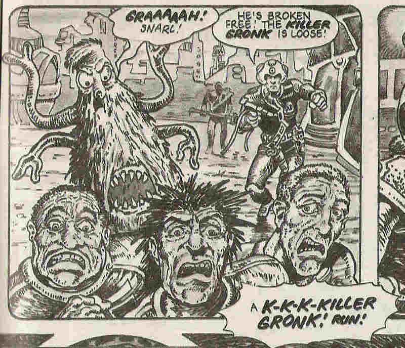
What? What the hell is this? This is a panel from StarLord, not the Beano. I love the Beano, but the two shouldn't share rubbish jokes about bullies running away from not-scary monsters that go 'snarl'.
-On the other hand, great facial expressions, and an enjoyable deadpan Alpha.
But as plot devices go, unnacceptable. Next!
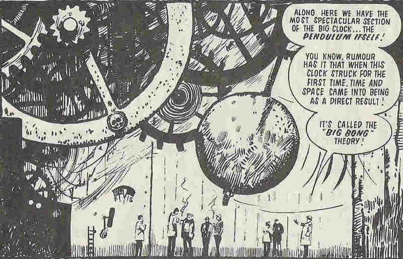 Now, as atmospheric panels go, this from Eric Bradbury is a big winner. Lovely clockwork mechanism with a feel of ancientness, a little bit of sinisterity, and even an amount of awe. But it's a big panel, meaning it's a pretty major part of the story it's in - a five page 'Time Twister'. Yes, folks, Alan Moore has struck again - a whole story leading up to a cheap pun. OK, so it's kinda funny, but really, not gonna win many converts to the 2000 AD stable.
Of course, it's in a different league from these two howlers. Better artists might have been able to make the action more convincing, but I'm inclined to blame the script droids...
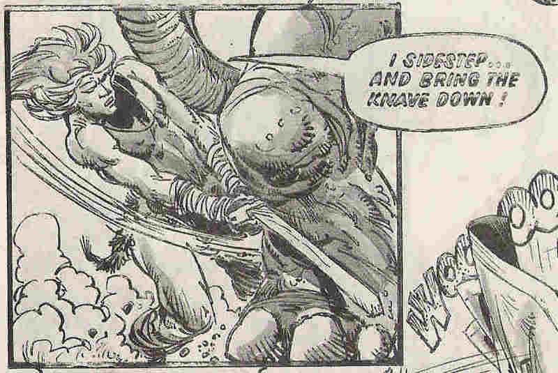 He's tripping an Elephant over. A whole, massive elephant. With a sword! A small sword, struck against one foot. He should be crushed, surely. What the hell??? Planet of the Damned, how much I wanted to like that story; how little I actually did.
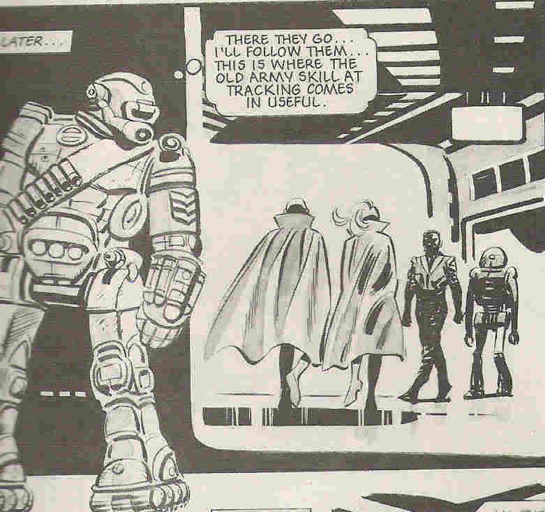 Ro-Busters, meanwhile, was often pretty good, especially when it moved into 2000 AD. Hammer-Stein, ABC Warrior extraordinaire, idol of thousands, how were you ever reduced to this?
Actually I think what gets me is the attempt to show a bulky, rigid robot trying to be bendy and slender. Extra points for making Hammer-Stein seem for human, but minus several hundred for what a robot might actually be able to do.
Of course, all of the above are pretty old panels as 2000 AD history goes. Here's a brace from the notorious nadir of 2000 AD history, the 900s:
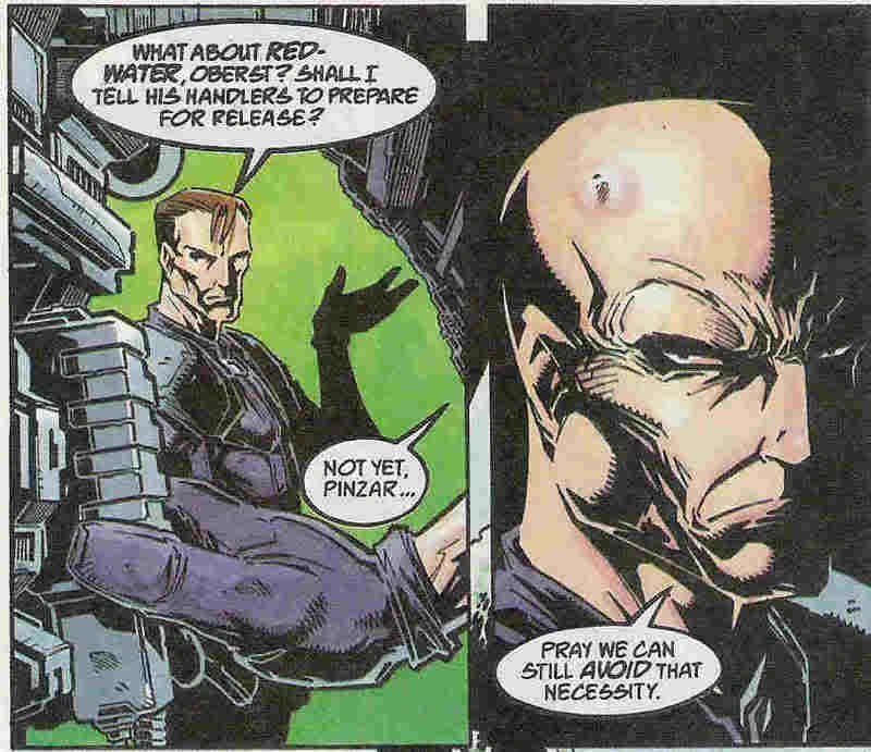 Abnett was writing about half the comic, which ought to be a good thing. For his short-lived Venus Bluegenes run, he was clearly going for all-out action film cliches. Simon Coleby assisted with some odd figurework and his usual chiselled faces. Sadly, I kinda miss the old Coleby style. Can't explain why, though. Anyway, read the dialogue above, and then guess what happens just one episode (roughly 10 panels) later...
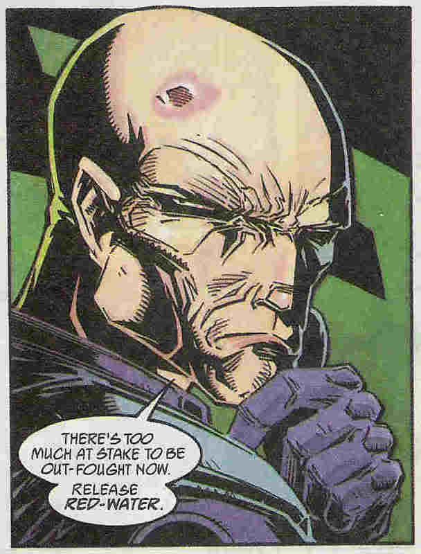 OK, so this was probably a deliberate mocking of your straight-to-video movie stupidity, but at the time I read it it felt like there was no effort put into giving the villain any real character or motivation beyond being mean-spirited. Nu-Earth villains are a tough bunch to write.
And, just when you thought Abnett couldn't lay on the cheap gags any more thickly,

*On reflection, there are surely many worse panels I could have found. I'll try harder next time, honest.
Without further ado,

What? What the hell is this? This is a panel from StarLord, not the Beano. I love the Beano, but the two shouldn't share rubbish jokes about bullies running away from not-scary monsters that go 'snarl'.
-On the other hand, great facial expressions, and an enjoyable deadpan Alpha.
But as plot devices go, unnacceptable. Next!
 Now, as atmospheric panels go, this from Eric Bradbury is a big winner. Lovely clockwork mechanism with a feel of ancientness, a little bit of sinisterity, and even an amount of awe. But it's a big panel, meaning it's a pretty major part of the story it's in - a five page 'Time Twister'. Yes, folks, Alan Moore has struck again - a whole story leading up to a cheap pun. OK, so it's kinda funny, but really, not gonna win many converts to the 2000 AD stable.
Of course, it's in a different league from these two howlers. Better artists might have been able to make the action more convincing, but I'm inclined to blame the script droids...
 He's tripping an Elephant over. A whole, massive elephant. With a sword! A small sword, struck against one foot. He should be crushed, surely. What the hell??? Planet of the Damned, how much I wanted to like that story; how little I actually did.
 Ro-Busters, meanwhile, was often pretty good, especially when it moved into 2000 AD. Hammer-Stein, ABC Warrior extraordinaire, idol of thousands, how were you ever reduced to this?
Actually I think what gets me is the attempt to show a bulky, rigid robot trying to be bendy and slender. Extra points for making Hammer-Stein seem for human, but minus several hundred for what a robot might actually be able to do.
Of course, all of the above are pretty old panels as 2000 AD history goes. Here's a brace from the notorious nadir of 2000 AD history, the 900s:
 Abnett was writing about half the comic, which ought to be a good thing. For his short-lived Venus Bluegenes run, he was clearly going for all-out action film cliches. Simon Coleby assisted with some odd figurework and his usual chiselled faces. Sadly, I kinda miss the old Coleby style. Can't explain why, though. Anyway, read the dialogue above, and then guess what happens just one episode (roughly 10 panels) later...
 OK, so this was probably a deliberate mocking of your straight-to-video movie stupidity, but at the time I read it it felt like there was no effort put into giving the villain any real character or motivation beyond being mean-spirited. Nu-Earth villains are a tough bunch to write.
And, just when you thought Abnett couldn't lay on the cheap gags any more thickly,

*On reflection, there are surely many worse panels I could have found. I'll try harder next time, honest.
Tuesday, October 17, 2006
Jigsaw Comics 1
Once upon a time there was an advert in the Guardian (and no doubt a bunch of other papers) for a job as an editorial assistant (or was it an assistant editor?) at 2000 A.D. Like many a foolish squaxx, I thought I should apply. I mean, that has to be a dream job, right? I have no idea if this is true, since I didn't even get to the interview stage. I suspect the main reason was that I had no relevant experience whatsoever. A degree from a good University, yes, but actual knowledge of how comics are made, or what editors do all day, nuh. I did think this would be a barrier, so in my innocence I thought I had to do something else to get noticed. Something that would prove that I had an intimate knowledge of what 2000 AD is all about, and proof that I had a creative mind, if not actual artistic or literary talent. So, I began this mission by buying a random selection of back progs, and cutting out some choice panels, speech bubbles, poses, backgrounds and whatnot. These cut-outs would represent the distilled essence of thrill-power (hey, that's not unlike what I'm attempting with this blog...).
The best bit was yet to come. I would re-arrange these panels and stick them together to create all-new comics. Thus showing my ability to understand how comics are made, what makes them readable, interesting, bold and of course totally zarjaz. In retrospect this was a bad idea. I was pretty sure that at least it would be memorable, although I now see that it would be memorable for being an example of someone who sent in a fan letter, not a job application...
So it goes. Of course, now I have a job which affords me reams of editorial experience so if I ever see a similar advert, maybe I'll re-apply, and maybe this time I'll at least get an interview. But no matter, because either way I've found a new hobby - jigsaw comics. Cutting out random choice panels and putting them together is awesome fun, although it's bloody hard. I've made a fair handful over the last four or five years, and I'm only just starting to get the hang of it.
As you'll see, my storytelling skills are rather lacking. Mood is the thing*, not narrative, I've decided. But it's clear that the pieces work better when there is a clear panel and caption/word balloon order. All of which is a huge pre-amble to say that sometimes I won't bother thinking of a 'real' topic to post on. Instead, I'll put up one of my jigsaw comics. In many ways, they can say as much about why 2000 AD is the stuff of legend better than my pseudo-intellectual musings.** So here's the first. It's a biggun. I tell you, if you ever try this, go for A4 pages, not A3. It just doesn't suit comics.
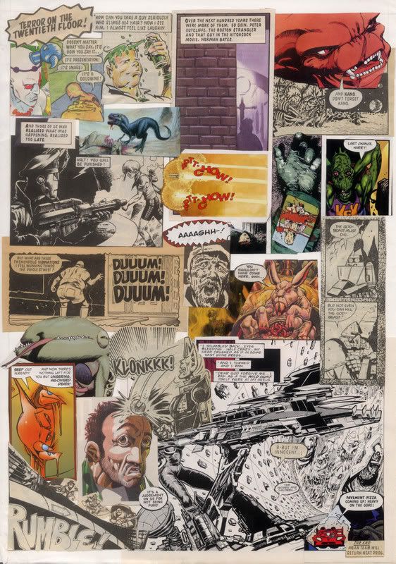
*If you're inclined to explore this piece in any detail, you might just be able to see a theme, but I damned if I can remember what it was meant to be. Something about things not being what they seem, maybe? A not very succesful mix of horror and slapstick?
**Of course, if you're a faithful squaxx (and let's be honest, who else is likely to read this blog), you can always have fun trying to remember where each piece of this jigsaw originally came from.
The best bit was yet to come. I would re-arrange these panels and stick them together to create all-new comics. Thus showing my ability to understand how comics are made, what makes them readable, interesting, bold and of course totally zarjaz. In retrospect this was a bad idea. I was pretty sure that at least it would be memorable, although I now see that it would be memorable for being an example of someone who sent in a fan letter, not a job application...
So it goes. Of course, now I have a job which affords me reams of editorial experience so if I ever see a similar advert, maybe I'll re-apply, and maybe this time I'll at least get an interview. But no matter, because either way I've found a new hobby - jigsaw comics. Cutting out random choice panels and putting them together is awesome fun, although it's bloody hard. I've made a fair handful over the last four or five years, and I'm only just starting to get the hang of it.
As you'll see, my storytelling skills are rather lacking. Mood is the thing*, not narrative, I've decided. But it's clear that the pieces work better when there is a clear panel and caption/word balloon order. All of which is a huge pre-amble to say that sometimes I won't bother thinking of a 'real' topic to post on. Instead, I'll put up one of my jigsaw comics. In many ways, they can say as much about why 2000 AD is the stuff of legend better than my pseudo-intellectual musings.** So here's the first. It's a biggun. I tell you, if you ever try this, go for A4 pages, not A3. It just doesn't suit comics.

*If you're inclined to explore this piece in any detail, you might just be able to see a theme, but I damned if I can remember what it was meant to be. Something about things not being what they seem, maybe? A not very succesful mix of horror and slapstick?
**Of course, if you're a faithful squaxx (and let's be honest, who else is likely to read this blog), you can always have fun trying to remember where each piece of this jigsaw originally came from.
Friday, October 13, 2006
Setting the scene
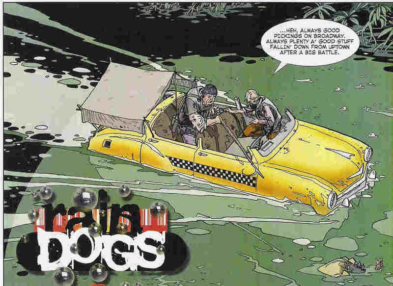 I've often felt that 2000 AD has maintained a much higher standard of art than many of its american cousins. The merits of individual artists is always subject to debate, but I don't think it's a stretch to say that 2000 AD puts more effort in, probably because it can afford to. After all, each artist only has 5 pages to fill per week, as opposed to 22 per month (although it does work out roughly the same if you think about it...) What I'm getting at is 2000 AD to my mind has never been shy of filling up a nice background to its panels, and as a result nearly always nailing the atmosphere of a strip to perfection. And yes, I am saying that the srt on a comic is inherently better if you draw in a background as well as your main characters, even if you are trying to make a point by just drawing your heroes in macho poses the whole time (yes, Image founders, I'm looking at you)*
Take the above, for example. Now, Rain Dogs is no masterpiece (probably a post on why, one day). Frankly, it was a bit rubbish, but that opening panel from episode 8 might make you think otherwise. In an instant, you can see that we're in New York (from the taxi), there's been a major flood, and scavengers are the main players in this setting. That neatly sums up all the good bits of Rain Dogs, and it's beautifully illustrated to boot. It also does an excellent job of being a 'calm before the storm' panel. Some heavy duty action is just aroud the corner, after all...
Here's another beauty from Henry Flint, very much in Kevin O'Neill mode (he also has a McMahon/Ezquerra mode, not to mention his own style, too):
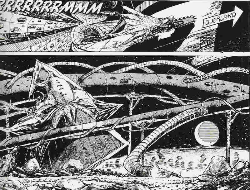 Just glorious, no?
In fact, I'm not here to talk about art. Rather, I'm interested in the idea of scene-setting. 2000 AD, as I love to try to prove, is a unique comic. All of its strips tap into some sort of atmosphere that is hard to define, hence the need for an infinite number of posts on the subject. But setting your story in the right time and place is definitely a big part of that.
On the one hand, the Rain Dogs panel shows you an economy of style that fills the reader in almost instantly. On the other hand, the panel from 'Deadlock', which shows the landscape of Earth several thousand years in the future (by which time it's called Termite), is an example of blowing your puny little mind. There is no frame of reference for this scene, and that's the beauty of it. I mean, I'm sure learned genre fans could point to influences**, but the average reader is simply given the sense that this story is in a weird place, with fascinating architecture that no-one would ever really build... would they?
And that ability to thrust readers into known yet unknown worlds is another of 2000 AD's strengths, one that founding father Pat Mills was especially good at.
But setting the scene isn't just about the art, it's about the characters, plot, and story, too. Here's a couple of opening captions to give you an idea:
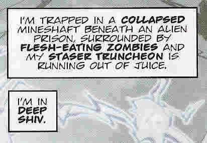
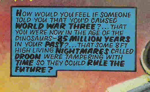 Now, these may not be much more than randomly thrown together Sci-Fi cliches, but the point is, that's just the opening caption for the ensuing five-page story. You're pretty much guaranteed that things will only escalate from here, probably with a handful of new ideas tossed in for good measure.
There's an old series from StarLord called 'Holocaust' that I only read for the first time a few months ago. The first episode was mildly entertaining, basically following a tough guy as he came to realise that aliens were invading - but no-one would believe him. This being a comic from the late 70s, I wasn't expecting much sophistication, so I thought the plot would unfold in a pretty straightforward manner, until this bit of exposition in the final panel of episode 1:
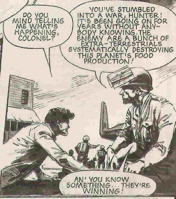
I mean, there's a whole nother 9 episodes of this bastard to go - and thanks to the 2000 AD (and sister publications) formula, it won't be 8 episodes of paranoia and frustration with a mild payoff, but 9 episodes of all-out war and other confounded expectations. Maybe not the best strip ever, but pretty exciting to this jaded 2000 AD reader. Better than Rain Dogs, anyway.
As well as foreshadowing the plot for an entire series, well-written exposition can also sum up a character neatly. Tanner from the Zero City cycle of strips is an old favourite of mine, although I get the impression that many other Squaxx weren't quite so keen, perhaps because of his overtly filmic credentials. Despite being the star of three series, we never find out much about who he is or where he came from - except this.
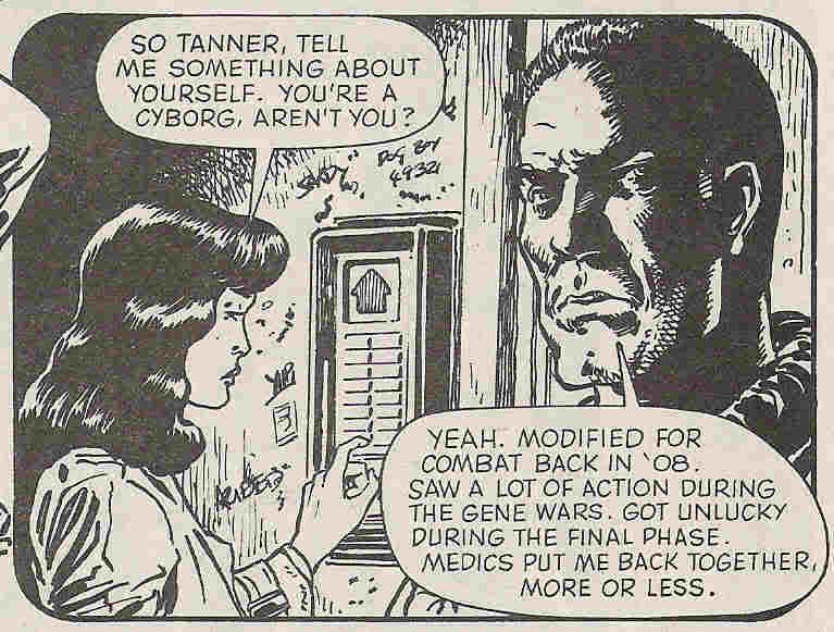 What else do we need to know? Back story out of the way in one panel, and we can get on with the story. Dave Stone would have done well to learn from this before launching his actually quite entertaining character Armitage into interminable strips about young Armitage. The first story was fine. He's hard and grumpy, the Brit-Cit justice is more liberal than Mega City One, but also more corrupt. We get it. Now tell some goddamn stories within that well-painted setting already. Sigh.
Sorry. Back to the point. When executed well, a simple scene setting panel or caption can really make a story into something special. Normally, 2000 AD does this rather well - with, naturally, a genre bent. Hence the title of this blog, which exactly the kind of caption you'd expect to find in the galaxy's greatest comic.
 A Graphic Novel to the first person who can tell me which story it's taken from...
and grateful thanks to anyone who can tell me how to put it into the title box for the blog.
*OK, so mostly I'm griping at Liefeld, but the whole trend seemed to be so much about drawing cool-looking figures that there was never room to show where they were, and as a result many of those stories made no sense whatsoever.
**Obviously Flint is referencing O'Neill's designs from the original Nemesis stories, but where did he get his images from?
Monday, October 09, 2006
Get your head out of the appendix, man
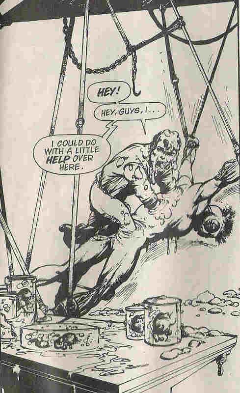
Small confession. Some of these 'Soft bodies' scans are not presented in the order they originally appeared. Given that I'm focussing on how confusing that series was, this might seem unfair. Be assured - it makes no difference whatsoever...
So, when we left, our new friends Fervent and Lobe were hiding inside a clone body that they had been pumping for information. I think Tyranny was in there with them, but she seems to have found alternative arrangements to escape.
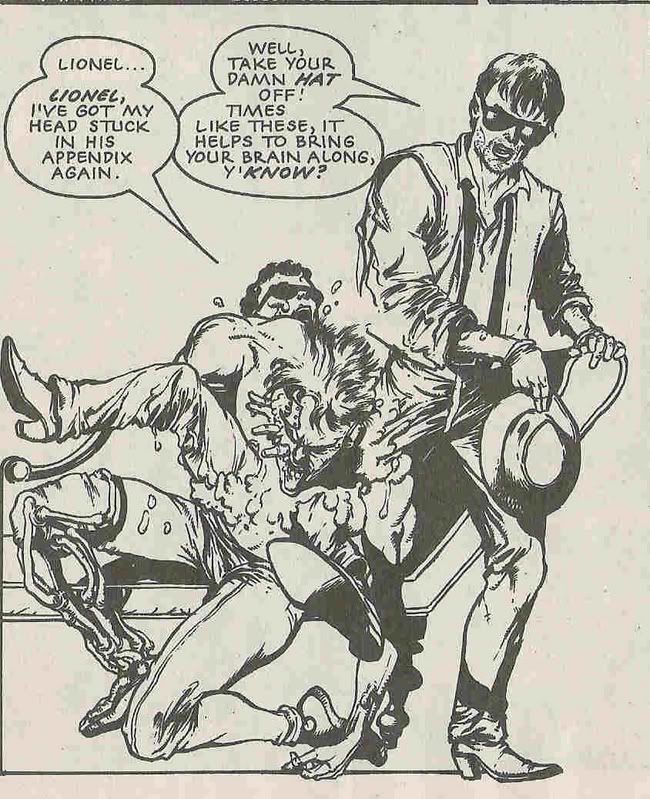
This is a classic 2000 AD panel. However confusing and pretentious T. Rex could be, it certainly fits right into its surroundings.
After a bit more pumping, the clone finally yields some answers.
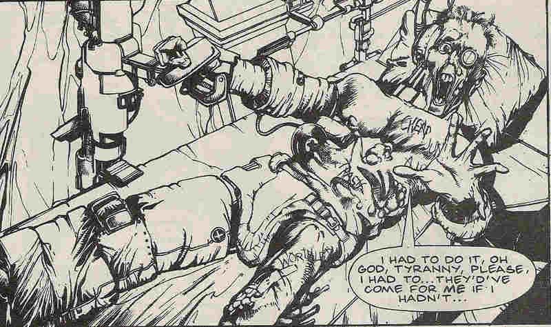
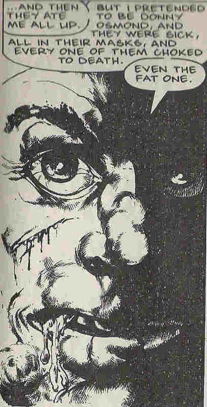
When I say 'answers', there's nothing exactly explicit in this confession. Extrapolating, and taking things as literally as possible (often a safe bet with 2000 A.D.), here's an idea about what the hell this clone is describing:
Various people have bought/stolen/kidnapped Tyranny's art ( which I may remind you are in-fact plastic-y clone bodies that she has 'sculpted'). Some people decided to eat these works, possibly to destroy them, but perhaps out of a desire to attempt cannibalism without having to eat an actual human, but reasoning that these clones probably taste the same. (It is of course not unusual for art lovers in any age to decide to try such a thing, doubly so in the future).
What they didn't anticipate is that these plastic clone-creations are still morphically able to control themselves, even after having been cut up into little pieces. This enterprising clone decided to rearrange himself into Donny Osmond (Tyranny's clones have a penchant for 20th Century popsters), and promptly caused an upset stomach to his would-be digesters.
The ensuing question - was this an act of art, terrorism, or art-terrorism? Does Tyranny care about her clones, or does she just not want her art to be abused? H'mmm.
So, any more answers forthcoming?
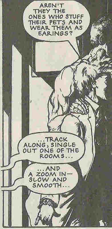
Well, we are still waiting for evil villain guy to stumble upon Fervent, Lobe and Tyranny, aren't we. Tyranny doesn't seem to concerned. She seems to be talking about the possible identity of said villains, when something odd happens - a voice from outside the panel...
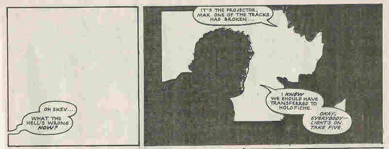 Yes, at last, the mystery is revealed. This isn't as such an episode from Tyranny's life, it's an extract from a film about said episode. It's deliberately full of weird jumps and narrative non-sequitors because the avant-garde filmmaker is going for a mood piece, not a straight action adventure. Or something. As plot twists go, it has more than little of 'and then I woke up' about it. But somehow it manages to be quite endearing at the same time.
It is soon revealed that no-one really knows much about Tyranny Rex, except that she ends up as a nun. To my mind, this is yet another parallel with Halo Jones. A much celebrated independent woman of the future, who has led several lives that others only speculate on. Of course, it could just be symptomatic of Smith getting bored of his creation and deciding to hide her away for a bit. (She would return to 2000 AD some four or five years later).
Anyway, there you have it - the most confusing series to come out of the galaxy's greatest comic - although there's definitely a case for Danzig's Inferno...

Thursday, October 05, 2006
Soft bodies - well 'ard
Hey, that was the cover copy for Prog 594, don't blame me. 2000 AD always did have a fondness for this kind of pun, or whatever it is. I suppose it's a general rule of magazines that their covers and headlines should attempt to be some kind of a play on words.
Anyway, what I'm here to do today is to explore the most confusing series ever to see print in the comic: Tyranny Rex's third outing, titled 'Soft Bodies'.
This is Tyranny Rex:
 You can't see it here, but she is part lizard, with a tail and everything. If you really closely at Will Simpson's picture, you can see some scales on her high cheekbones. First drawn and presumably designed by Steve Dillon, king of clear storytelling, she is in fact the creation of writer John Smith, king of obscure storytelling. Thus ensues a character who is likeable and interesting, appears only sporadically, and has adventures that are generally weird.
Before launching into 'Soft Bodies', it's worth attempting to describe Tyranny's world, at least, as far as is known, even today - 15 years and about 10 longer adventures on.
I think Tyranny is mainly an artist, although she's clearly also some kind of mercenary. The big thin in art in whatever far future time we're in is cloning, or at least, body-building (other people's, that is, not your own!). These creations are clearly not fully human, don't have the same life experiences or rights, but appear to be sentient beings. Sadly, this is all pure speculation, as this aspect was never much drawn out in the strip. Mostly it was an excuse to have a rather well rendered clone of Prince wandering around using text speak.
So, on to 'soft bodies' - a title that surely refers to the artistic creations of Tyranny and a bunch of others. It might also turn out to have a meta-meaning as well, you never know. For this 5-parter, John Smith was joined by Chris Standley on scripting, which apparently made for an even more obscure story than usual. New artist Will Simpson was a radical change from Dillon, but he turns out to have a great way with the clones, and a nicely realist touch. I get the impression that Smith wanted T. Rex to be realist in the same vein as Halo Jones, but was more interested in what the weirdos of future worlds got up to. Indeed, this may have been a succesful concept if the 2000 AD remit hadn't required both Rex and Jones to end up toting massive guns.
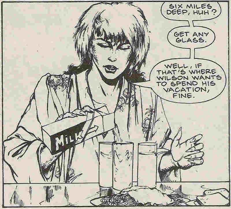
Anyway, the realistic angle is, I think, already clear from the dialogue in the panel above; Smith/Standley are attempting to script genuine conversation, with all it's half-finished sentences and non-sequitors. Of course, you have to read carefully to follow this kind of dialogue. Sure, sometimes there are things left unsaid in real life, but it gets confusing in a comic strip that only has five poages a week to play with.
Look, I've read this story about 4 times, and it's evident that the art is clear and occasionally beautiful. Simpson surely drew each panel as asked, so the problem lies with the script. Except, annoyingly, it's not a problem, it's deliberate.
So, what happens after Tyranny pours a glass of milk for her companions?
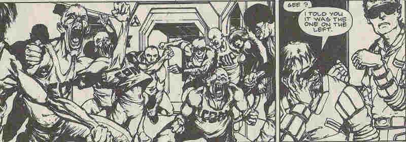 Clone attack!
(The two beshaded dudes are Fervent and Lobe, operatives for 'Indigo Prime', another innovative John Smith concept. Like all members of Indigo Prime, the pair are dead. This is referred to in 'Soft bodies', but not in a way that makes any sense until Indigo Prime got their own series about 2 years later...)
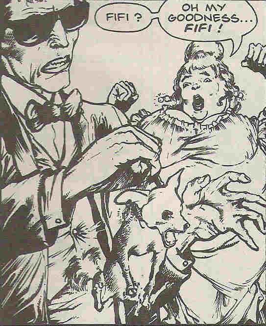 Next, Fervent upsets an art dignitary by assuming her dog is evil. Everyone is forced to escape by helicopter.
 Oblique references are soon made regarding Fervent and Lobe's relationship. (Hey, it was way oblique to me when I was 11). Possibly the only acknowledged gay couple in 2000 AD? Also, first in a long line of gay characters created by Smith, although Milligan and Morrison were keen to get a few of their own in, too. All with a delightful lack of fanfare from Tharg, who is always keen to let his droids just get on with telling good stories.
So far, the story makes sense, even if we don't really know who the characters are or what their motivation is... Tyranny, I think, has been hired to find out why a bunch of clones are breaking down, including a few of her own. She rounds up Fervent and Lobe to help her (they're kind of psychic or something). They break into some compound and get harrased by some rampant clones, then find themselves at a posh art ball. So far, so bizarre, but the narrative just about holds up.
Then, an unherladed evil John Smith villain (refined, distinctive haircut, likes torture - see every Smith story ever) turns up from nowhere. Not clear what his agenda is. Tyranny, Fervent and Lobe are safely hidden away inside a clone's body (hence the darkness)...
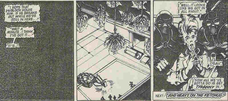
At this point the story pauses for about 6 weeks. Now, this may have been due to a slow artist or a printing problem, but I don't know; Will Simpson managed to squeeze in a couple of Dredds while the readers were waiting for part 5 of 'soft bodies'. The conspiracy theorist in me suspects it was a deliberate request by the writers. I mean, how typical is it to have four episodes in a row, then a long wait for just the final bang? Of course, now I'm going to make you wait, too.
Anyway, what I'm here to do today is to explore the most confusing series ever to see print in the comic: Tyranny Rex's third outing, titled 'Soft Bodies'.
This is Tyranny Rex:
 You can't see it here, but she is part lizard, with a tail and everything. If you really closely at Will Simpson's picture, you can see some scales on her high cheekbones. First drawn and presumably designed by Steve Dillon, king of clear storytelling, she is in fact the creation of writer John Smith, king of obscure storytelling. Thus ensues a character who is likeable and interesting, appears only sporadically, and has adventures that are generally weird.
Before launching into 'Soft Bodies', it's worth attempting to describe Tyranny's world, at least, as far as is known, even today - 15 years and about 10 longer adventures on.
I think Tyranny is mainly an artist, although she's clearly also some kind of mercenary. The big thin in art in whatever far future time we're in is cloning, or at least, body-building (other people's, that is, not your own!). These creations are clearly not fully human, don't have the same life experiences or rights, but appear to be sentient beings. Sadly, this is all pure speculation, as this aspect was never much drawn out in the strip. Mostly it was an excuse to have a rather well rendered clone of Prince wandering around using text speak.
So, on to 'soft bodies' - a title that surely refers to the artistic creations of Tyranny and a bunch of others. It might also turn out to have a meta-meaning as well, you never know. For this 5-parter, John Smith was joined by Chris Standley on scripting, which apparently made for an even more obscure story than usual. New artist Will Simpson was a radical change from Dillon, but he turns out to have a great way with the clones, and a nicely realist touch. I get the impression that Smith wanted T. Rex to be realist in the same vein as Halo Jones, but was more interested in what the weirdos of future worlds got up to. Indeed, this may have been a succesful concept if the 2000 AD remit hadn't required both Rex and Jones to end up toting massive guns.
Anyway, the realistic angle is, I think, already clear from the dialogue in the panel above; Smith/Standley are attempting to script genuine conversation, with all it's half-finished sentences and non-sequitors. Of course, you have to read carefully to follow this kind of dialogue. Sure, sometimes there are things left unsaid in real life, but it gets confusing in a comic strip that only has five poages a week to play with.
Look, I've read this story about 4 times, and it's evident that the art is clear and occasionally beautiful. Simpson surely drew each panel as asked, so the problem lies with the script. Except, annoyingly, it's not a problem, it's deliberate.
So, what happens after Tyranny pours a glass of milk for her companions?
 Clone attack!
(The two beshaded dudes are Fervent and Lobe, operatives for 'Indigo Prime', another innovative John Smith concept. Like all members of Indigo Prime, the pair are dead. This is referred to in 'Soft bodies', but not in a way that makes any sense until Indigo Prime got their own series about 2 years later...)
 Next, Fervent upsets an art dignitary by assuming her dog is evil. Everyone is forced to escape by helicopter.
 Oblique references are soon made regarding Fervent and Lobe's relationship. (Hey, it was way oblique to me when I was 11). Possibly the only acknowledged gay couple in 2000 AD? Also, first in a long line of gay characters created by Smith, although Milligan and Morrison were keen to get a few of their own in, too. All with a delightful lack of fanfare from Tharg, who is always keen to let his droids just get on with telling good stories.
So far, the story makes sense, even if we don't really know who the characters are or what their motivation is... Tyranny, I think, has been hired to find out why a bunch of clones are breaking down, including a few of her own. She rounds up Fervent and Lobe to help her (they're kind of psychic or something). They break into some compound and get harrased by some rampant clones, then find themselves at a posh art ball. So far, so bizarre, but the narrative just about holds up.
Then, an unherladed evil John Smith villain (refined, distinctive haircut, likes torture - see every Smith story ever) turns up from nowhere. Not clear what his agenda is. Tyranny, Fervent and Lobe are safely hidden away inside a clone's body (hence the darkness)...

At this point the story pauses for about 6 weeks. Now, this may have been due to a slow artist or a printing problem, but I don't know; Will Simpson managed to squeeze in a couple of Dredds while the readers were waiting for part 5 of 'soft bodies'. The conspiracy theorist in me suspects it was a deliberate request by the writers. I mean, how typical is it to have four episodes in a row, then a long wait for just the final bang? Of course, now I'm going to make you wait, too.
Monday, October 02, 2006
A quick tour of British humour
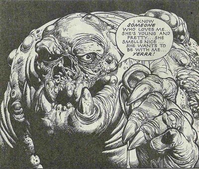 ... that's you, that is.
 OK, so that joke's probably only funny if you were watching TV in the UK in 1991/2. But with that in mind, I'm going to take you on a small journey through a bit of comedy via the medium of 2000 A.D. Sorted by type of joke, since cataloguing makes everything inherently funnier. Oh, wait, that's the opposite of true. Tough. Here we go...
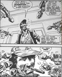 The straightforward 'joke' joke. It's so obvious why this is funny that I can't even explain it. Foreign editions of Robo-Hunter: Day of the Droids would have no trouble translating this joke.
Next, the simple pun. Not really a joke, but you can tell that the writer was pleased with himself when he snuck this one past his editor. (Who happened to be called K. Gosnell, for 10 extra trivia-joke points)
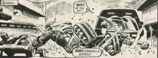
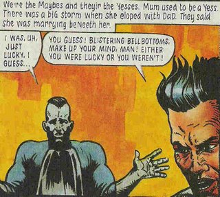 And the more elaborate pun, again involving comedy names, but this time it's actually funny. Could add an extra 5 points for the bad PJ Maybe spelling involved. Not really funny, but it sets up the whole story as a comedy.
Moving on to a trivia joke:
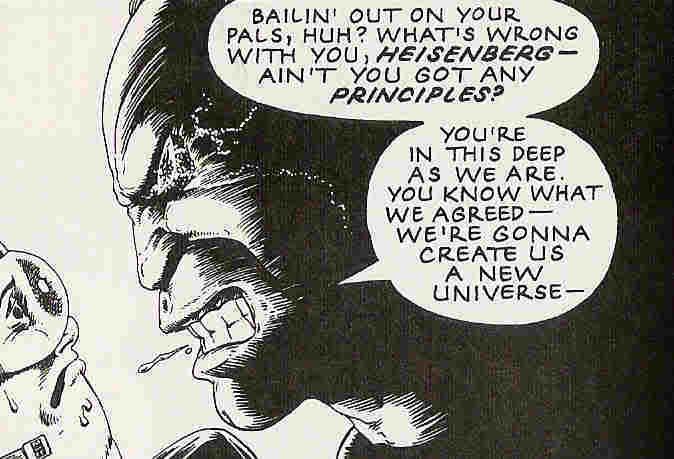 This seems to me to be obviously a joke, but if you don't know who Heisenberg is, you won't get it. (Professor who came up with the 'uncertainty principle'. A nicer blog would have a wikipedia link here). These jokes get extra points for making you feel good about yourself if you get them, because you can smile at your own cleverness whilst laughing at the joke. Alan Grant loves these jokes, and good on him for that. I have this racist idea that an American writer wouldn't use this kind of joke, or at least would feel the need to set it up so that every reader could get it, thus rendering it extremely unfunny. Which leads us into: jokes at Americans' expense.
 Hooray, sarcasm.
In a similar vein, local geography jokes (this one's also kind of at America's expense, so double points):
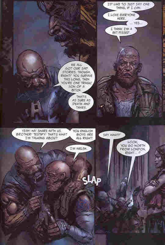
I mean, fancy not having heard of Wales. Second added bonus - drunk jokes. Not as common a feature of pubs as this kind of humour leads one to believe, but still a worthy example of comedy of observation.
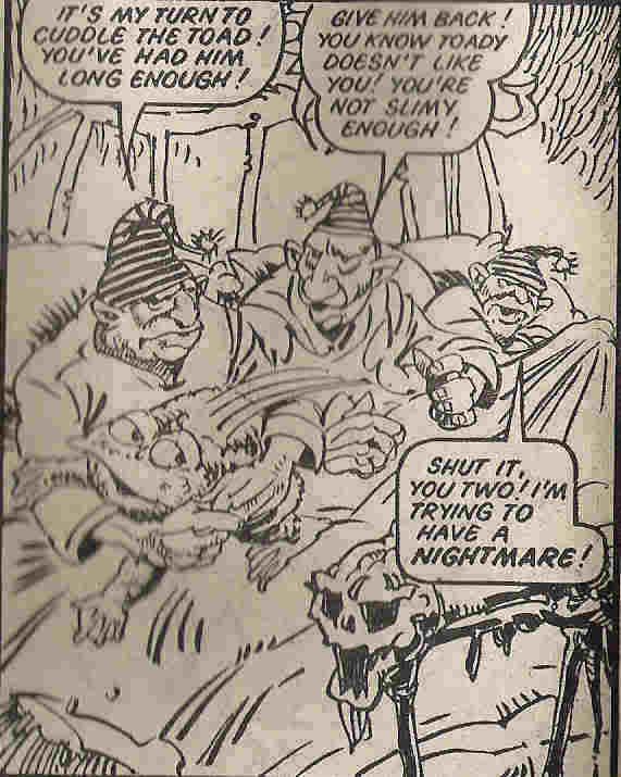
And to end this session with something outrageously British, here's three villains in a bed (inherently funny) making very mild all-ages jokes (not very funny, but young children can understand them). I imagine that the comedic device of being evil - therefore liking bad things like slime and nightmares - is universal (cf Bizarro and Fungus the Bogeyman).
