Tuesday, May 29, 2007

Homosexual heroes


In the future, hopefully people won't be so hung up about sexuality. I wouldn't go so far as to say that 2000 AD has actively explored this particular aspect of future living, but in my head at least the comic has been pretty good about a) not really showing sex that much except when relevant b) not being afraid to have characters who happen to be gay but this is not the main point of the story. Which one suspects is in no small part thanks to the efforts of writers John Smith, Peter Milligan and Grant Morrison. I have no knowledge of these individuals sexuality (I think the last two are married to women?), but they're all great at using gay/bi/lesbian/'actually I don't care for labels but I like having sex' characters in a pleasingly offhand way. I guess John Smith wins the prize for his creations such as Devlin Waugh and most of the Optimen out of New Statesmen.

[Oh, so you want a list of out 2000 AD heroes? Tricky. Devlin Waugh; Fervent & Lobe; Hannah Chapter; Dante's mum's first mate; Bix Barton(?); all John Smith villains; I know this list should be longer given what I've said...]

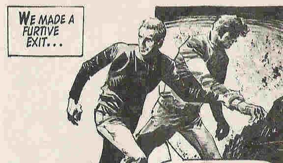
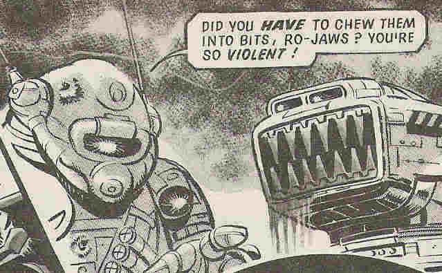
Characters from the Wagner/Grant/Mills camp tend to avoid overt discussions of sexuality, but again there's a welcome offhandness about the whole thing. Obviously many jokes have been made about Johnny Alpha and Wulf - despite the obvious insertion of Durham Red as a sort-of love interest for Johnny after Wulf's death. One hopes that they all find happiness where they can get it. In Mills's worlds of khaos, one assumes that picking and sticking to a rigid sexuality is just plain wrong. Even straight-laced Hammer-Stein is pretty gay in Ro-Busters.
I guess I'm rambling here, but the point is that I welcome 2000 AD's efforts to feature non-hetero characters. I think it succeeds in this a little better than it does with its efforts to balance race and gender, although in those two it's streets ahead of your superheroes (says the white male...). Or maybe it's just that since sex features so scarcely in 2000 AD (except for Nikolai Dante and Valkyries and rare occasions elsewhere), it's easy to project a sexuality onto the characters. Of course, a lot of this reading into stuff will be to do with the artist. Again, I don't know or necessarily care if any given artist is trying to do this, but it's fun to speculate.

Case in point, the Harlem Heroes. No, not the all-black aeroball players who I suspect aren't far enough in the future to be out sportsmen, but rather their 90s counterparts who are much reviled by the squaxx community. Personally, I thought the first 6 or 7 episodes where they break out of prison were ace. But then it just got a bit silly. Some of the stories in the late 700s featuring individual heroes were ok. Anyway, by the time of 'Cyborg Death Trip' in 928-939 or thereabouts, it seems that Tharg was trying to ditch the (pre-written) series, and therefore deliberately made it ridiculous with cheap art and what I imagine must have been re-written comic dialogue. The upshot of which is, all of the characters are gay. All of them. This is properly awesome.

I have an idea that Patrice and possibly Trips were meant to be gay in the first place (the clue's in the name - and lest you think I'm pandering to stereotypes, let's not forget that series creator Michael Fleisher is not known for his subtletly. Blame him if you must). Clearly there was banter going on between surly Slaine-lite figure Slice and tough yet fashion-conscious Tyranny Rex-lite Silver. But in Cyborg Death trip, the two are separated for almost the entire storyline, and their bickering/simmering passion is re-centred on two new recruits to the heroes - a deadly eye-patched woman for Silver, and a slick shaded man for Slice. It's beautiful. And Deacon? Well, here I'm just seeing things, but given that he has absolutely no love interest whatsoever I'm required to make up my own version. And I know what makes the series more fun, so I'm going with that.
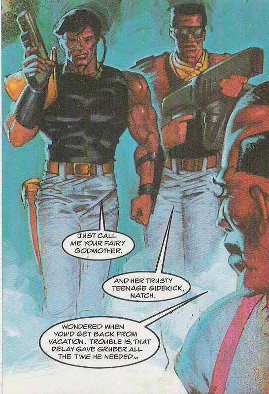
Lovely work from Siku, who I think understood the emotional subtext perfectly.

Dash it all, now I feel guilty for suggesting that Tharg deliberately made the Heroes gay to make the series funnier. It DOES make it funnier, but it shouldn't just for that reason. Obviously not because being gay is funny, but because it subverts expectations, you see.

Sunday, May 20, 2007

Alien aliens

One of the great staples of sci-fi, and by extension 2000 AD, is the alien. The trick is always to use both the writing and art to create something that is as 'other' as possible. Aliens that are simply cute or nasty or a combination of both is not enough. The best aliens always have something about them that is just weird - something we as humans cannot relate to. I guess until we actually encounter a real extra-terrestrial life form, this is probably going to be impossible. Human creators can never really imagine something entirely out of the human sphere of experience, can they? Which is I suppose why so many sci-fi writers use aliens to exaggerate certain features of humanity, often with some kind of political point to make (I'm thinking Star Trek does this pretty overtly with aliens like logical, emotionless Vulcans, warlike Klingons, assimilatory Borg etc).

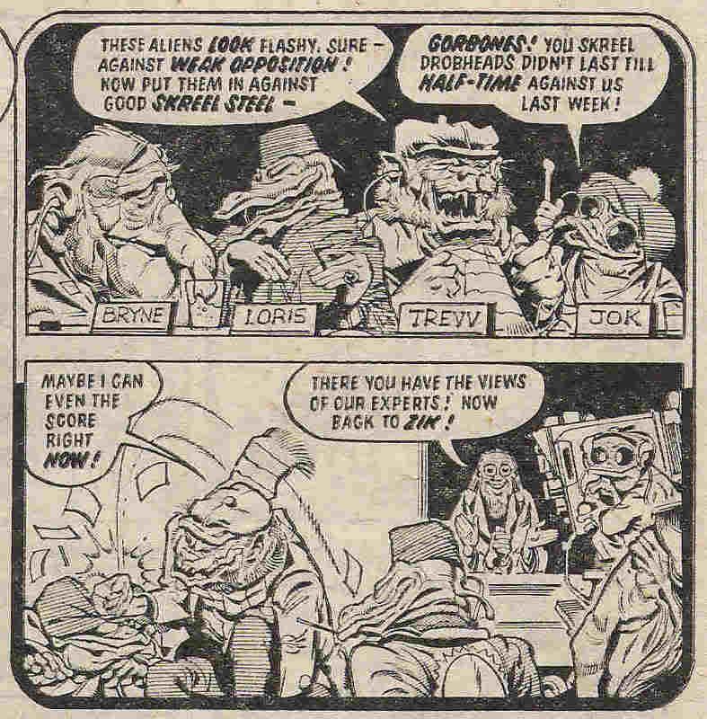
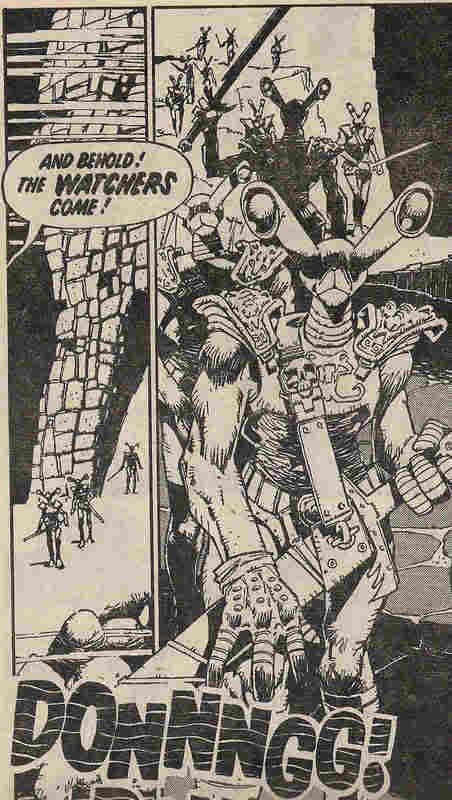
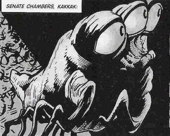
Anyway, this is all well and good, but often less fun for the artists. And although 2000 AD has some fine moments of political commentary, it also has some equally fine moments of alien bizarritude. Curiously, Pat Mills has often been the best writer at both these ends of the alien spectrum. Many artists have been blessed with this skill, but I rate above most others Kev O'Neill, Henry Flint and Ron Smith as designers of alien aliens. The undisputed master is of course the late Massimo Belardinelli. It's truly a crime that I don't have scans of his artwork to show off at this point. It will come in time, I assure you. Instead I have a simple but hopefully evocative selection of alienity.


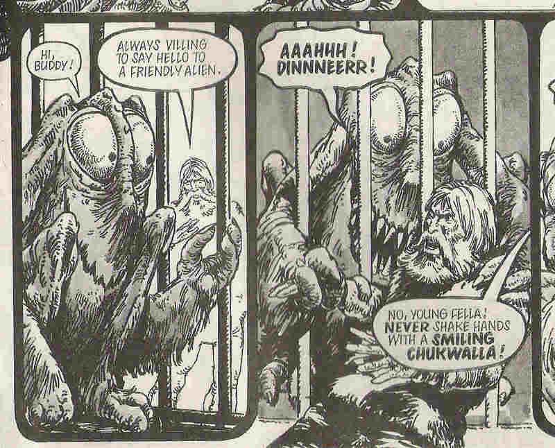
A very well executed example of the cute alien that turns out to be mean, courtesy of Wagner and Ezquerra. Funny especially because of the chukwalla's all too British slang.

More comedy, this time from Ron Smith. If in doubt, give your alien an absurdly wide jaw and lots of teeth. Then have it eat a human for one level of laughs - or mete out violence on a rival alien, which is somehow funnier.

Something sinister from Mike McMahon. It's only two panels, but you can already tell that there's something particularly alien about the way these creatures walk, something altogether unsettling. Which partly works because of their humanoid physique. I guess it relates to the 'uncanny valley' in robotics/animation, which is a phrase to describe the problem that a creature that looks very humanlike but not quite exactly humanlike is one of the most horrible things to behold. Hence many animated films go for a caricatured look rather than a realistic one.

John Higgins here, weighing in with the cute factor. But not too cute, owing to the juxtaposition of large eyes and lots of spiny legs. Or maybe it's just me who's creeped out by insectoid features? It's worth adding that this panel is taken from 'Freaks', a surprisingly good strip about humans encountering aliens. The first series written by Milligan was better, getting across a great sense of that future shock staple of humans being the freaks on an alien planet. But the second series a couple of years ago was actually pretty funny, if less impressive on the whole 'what makes an alien an alien' front.

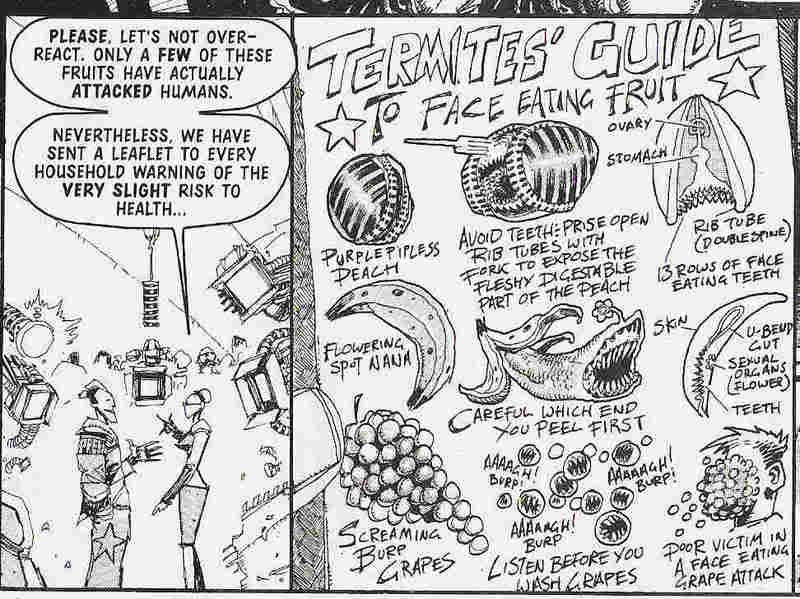
Time to bring on the Mills at last, although one suspects that Flint may have had as much if not more input on this beautiful pamphlet:
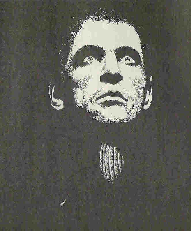
On the other hand, this is exactly the sort of thing that Mills is very good at. What would an 8-year old find slightly terrifying, but also hilarious? face-eating fruit, that's what. And that's partly what Nemesis the Warlock (above picture actually from spin-off series Deadlock) is really about, isn't it? Sure, there a whole 'good vs evil no wait evil vs evil' thing going on, but I fell in love with the strip because of all the craziness going on in each new episode. And I may have said it before, but Nemesis remains one of the most effectively alien aliens in my eyes. Sure, Morrison and Flint have surpassed the design weirdness with the efforts in Shakara, but Nemesis continues to be frankly terrifying as a concept, not least because of his face. But who can say whether it was Mills or Hicklenton who took this curious decision. What would the most alien of aliens, the Lord of the Flies, the Deathbringer himself look like if he took on human guise?

Apparently he'd look like David Gahan out of Depeche Mode...


Tuesday, May 15, 2007

Random Prog Review: Megazine 2.29

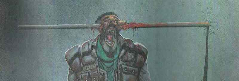
What's black, white and red - and can't turn around in corridors?
-A nun with a javelin through her head.

Ok, so there aren't any nuns in this issue of the Megazine (thankfully Soul Sisters was long forgotten by this point). But there is this:
Yay Kevin Walker. And so, on with the review.

The Megazine volume 2 was still finding its feet a little, but for me this issue marks a turning point. Basically, editor Bishop had finally sorted out a strong line-up of writers, artists and strips, after a brief period of quality that saw several issues featuring some real drek (Heavy Metal Dredd, Sleeze N Ryder) alongside true gems such as Mechanismo and Grant/Ranson Anderson Psi stories.

In a turn of events I think few can have predicted, issue 29 opens with an apology... to the Hell's Angels...
I reckon it made their day to have to write that.

Judge Dredd: Jigsaw Murders part 3 by John Smith and Xuasus
There's a fair old debate raging at the moment about the 'Complete Judge Dredd Case Files', and whether to continue the collection into the colour period. This story is a classic example of why it's not an easy decision. Basically, the story and art just aren't that good. They're ok, entertaining enough, but not particularly deserving of a reprint. And the art is of that infamous murky brown variety that I gather is very hard to scan in effectively, let alone convert into black and white.

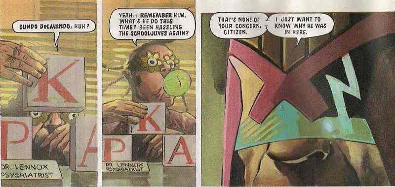
Smith tends to play his Dredd efforts fairly straight, in this case focusing on the villain - a killer who is looking for body parts to re-attach to his own mutilated body. Dredd himself is basically grumpy and doesn't have to do much except follow the clues. One of the things that Smith does do well in Dredd is to use the myriad ideas about what people and places in Mega City 1 are like - i.e. full of weirdoes. Here's Dredd talking to the killer's psychiatrist, who just happens to be a Simp (and an irritating dolt as well)
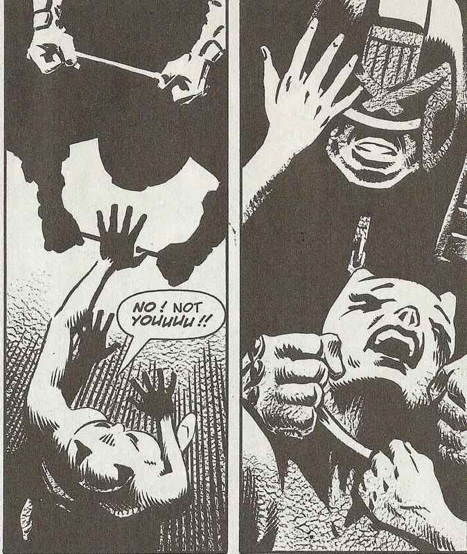
Suffice it to say, Dredd catches up with his man and dismembers him, an example of the punishment fitting the crime o something like that.

Verdict: not the worst Dredd by a long shot, but the least interesting story in this Meg.

Judge Hershey: A Game of Dolls part 3 by Igor Goldkind and Kevin Cullen
Let me start by saying I love Cullen's art style. It's confusing to me that he had steady Megazine work for about two years, then suddenly he disappeared. I guess nowadays one could say that he's not as good as Frazer Irving, but at the time I hadn't seen anything quite so suited to the creepy-type stories one wants to read from time to time - you know, the ones that aren't played for laughs. The script is ok, too. The story, on the other hand, is a little week. Actually, you can read it for yourself if you care to purchase the latest Extreme Edition. I guess it's worthy of a reprint, but you see, it's yet another 'Judge gone bad' tale that I find slightly annoying ever time one gets printed. This one's got a psychosexual motive:

He likes strangling prostitutes and then playing with them like he played with the dolls he had when he was a little boy. Sure, 8/10 points for creepy imagery, but 2/10 for originality. Also, -8/10 for being set in a seedy part of town (where are the nice bits in MC1 exactly?). Most of all, it bugs me the sheer number of corrupt of perverted Judges that seem to crop up in these kinds of story (the previous Hershey tale had them, too). Sure, if she was an SJS Judge then that would be appropriate. But she's not. And it just makes me think that the whole Judge-as-Monk concept doesn't work, if so many writers need to take the corruption/madness route to tell a Judge-based story. Wagner and Grant hardly ever do it.

Verdict: great atmosphere, good Hershey, shame about the plot.

Anyway, on with the Meg. There's a brief interlude in which Bishop proudly proclaims a rather large number of awards the magazine has recently received from a 'Comic World' poll. This is all well and good, except that the winner of 'most promising new writer' is Gordon Rennie - a man who up to that point hadn't written anything yet! Well obviously he had, but not for 2000 AD / the Megazine, I don't think. I've not read 'White trash', but I guess it must be pretty good. Personally I didn't really rate Rennie until he was well into Missionary Man, and not in 2000 AD until Necronauts. He's pretty damn good now, of course.

Missionary Man: Salvation by Gordon Rennie and Frank Quitely
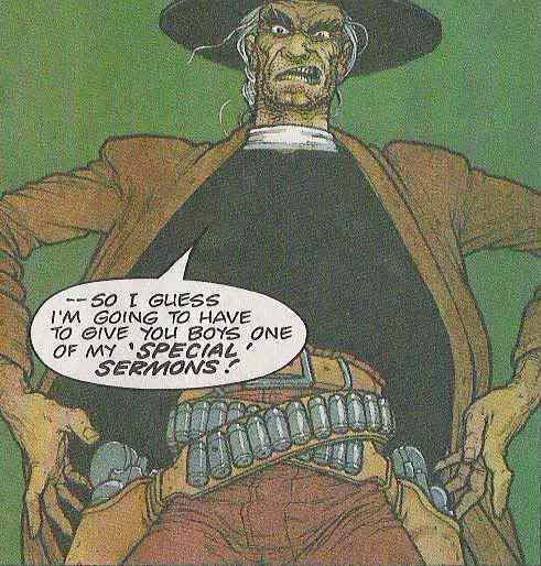
Well then, the first episode of Missionary Man. Quitely's art came out fully formed, didn't it? Not perfect figurework, but literally everything else was pretty perfect I'd say. As for the story, well, in hindsight, it's an ideal introduction to the character. But at the time it annoyed me. I didn't see what was good about a Preacher who liked to kill people. It all seemed a bit cliched: you know, spouting Biblical passages about vengeance and then shooting sinners. I don't know where the cliche bit of this comes from, it might just be that I felt angry at having an overtly christian character being portrayed as such a nutter, and a self-righteous one at that. Having read the whole series now, I'm still a bit confused about where exactly Preacher Cain gets his christianity from, and by what token it's ok for him to act as God's personal Judge and housecleaner in the Cursed Earth, but the whole thing works. There's something a bit silly about first episode, though.


Verdict: Quitely is amazing; Rennie has a way to go to earn reader sympathy for his hero.

Anderson Psi Division: Childhood's End part 3 by Alan Grant and Kevin Walker

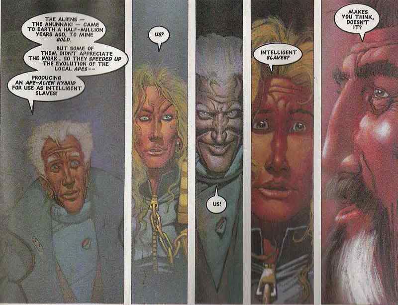
Whoops! Mild spoiler there. Not really, of course, as the 'revelation' in this episode of this classic Anderson story about Aliens having shaped human culture is hardly a new Sci-Fi idea (DR & Quinch have fun on Earth, anyone?), but it is a fun one, and at the time I remember being genuinely impressed by it - and there are bigger twists to come...

The idea that humans are not their own masters would go on to have a big impact on Cassandra Anderson, leading to a short series in which she gies on a voyage of self-discovery in space that was sort of interesting, but ultimately unsatisfying. I think Grant took her character so far away from the core of fascist, monastic Judges that he never really made it believeable that she would slide right back in to that system. All in all this series was a true epic with a big-budget action movie feel. Kevin Walker had a strange thing for long noses in this period of his art though, eh?

Verdict: one of the best Anderson tales, if you don't mind action movie staples. Good gore, and not too much cheesecake.

Sunday, May 13, 2007

The things comics can do

There's no unifying 2000 AD theme as such to this post, but I felt like unleashing another batch of prime panels that show off the unique(ish) abilities of comics, my favourite medium. Of course, it's best to do this kind of thing with help from the master writers, artists - and this time around, letterers - which is where 2000 AD comes in.

Let's start with something simple - the double meaning.

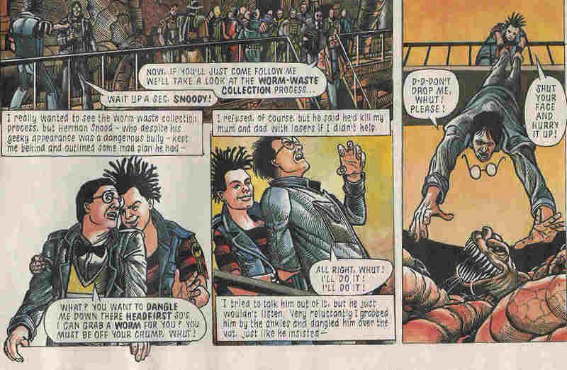
The story here is narrated by one D. Menace (the lad in the black and red jumper). If you have keen eyes or can enlarge the scan somehow, you'll see that the caption boxes tell his account of the events that happened on a school trip to a munce factory. The pictures of course tell a different story. As you can see, W. Softy might take issue with the account in the captions. Obviously this sort of thing has been done in films (most famously Rashomon and I suppose the Usual Suspects does something similar), but there's something uniquely satisfying about seeing the truth and the lie together in the same panel. Anyone who grew up reading British comics will of course also appreciate the use of the Beano's Dennis and Walter to make it eve more transparent what is really going on - straight up bullying.

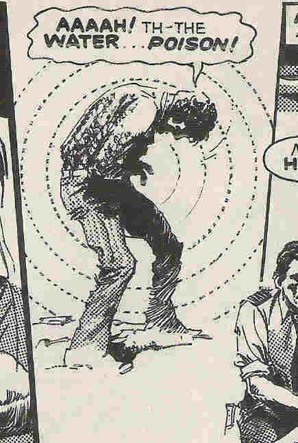
Here's an artist's trick: use of lines to indicate that something is awry.

There's probably a technical term for this but I'm blowed if I know it. I guess this again has a filmic equivalent - using a shaky camera to denote drunkenness or that comedy fisheye lens bit from the peyote sequence in Young Guns. I think it looks way cool in this 70s comic style. It'd be interesting to see if it would work without the explanatory caption, though. Anyway, what do you expect when you drink from a lake on THE PLANET OF THE DAMNED, eh?

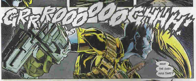
Here are two lettering techniques in action:

Poor old Venus Bluegenes. Going about her sneaky business when suddenly an awesome growl rips through the panel borders and interrupts her train of stealth. We can see just how disconcerting this is because her speech then follows in three separate balloons. OK, so it's not a groundbreaking technique, but it really works to get across the emotion. It bugs me sometimes when one has to re-read a balloon several times to work out all the nuances of emphasis. Although it bugs me more when some letterers/writers/editors (whoever it is that makes the final decision) put some key words in italics to help with this, but then pick the wrong words. Grooh.

This one's fun - use of space. A trick known to fins artists since at least the Renaissance and probably since chalk was discovered, it still works a treat.


In comics, of course, a canny artist will use this kind of room to carry the readers eye around the page, as well as to service the emotion. There is a certain amount of backstory to add to the despair evident in this bleak, black panel. Novice Strontium Dog Feral has recently learned that he is not just a mutant, he is also the son of a demon. A particularly nasty demon. The same demon, in fact, who killed his mentor and much-mourned friend (actually they mostly fought and bitched at each other) Johnny Alpha. And in order to find out what the Hell this all means, Feral has just killed himself with the intention of journeying to the lowest pits of said Hell to find his now dead Demon father. Mmmmm bleak. Which is one reason it always bugged me that Nigel Dobbyn was the artist for this series. He's great at soap opera and cuddly stuff (who didn't love Medivac 318? No, really, it's way better than Mercy Heights), but not so great with the horrific mutation business. Still, he came up trumps with this panel. The emotions will be cranked up another level when Feral meets Alpha in Hell...

Another film classic next - the montage. Once again, comics has a necessarily different approach in that a) there is no stomping 80s power ballad to guide you through the scene, and b) you can see all the action on one page. Anyway, here's the mighty Flint showing what it would look like if a horde of Judges go on a spree of arrests in order to root out Total War terrorists.
Flint's awesome, isn't he? Dig the way he uses some panel borders as a time-gap device, and others to frame different parts of the city all on the same page. Groovy.

Of course, one of the all time great comics artists cut his teeth on Judge Dredd as well. That'd be Brian Bolland. Sometimes I found his strip work a bit tiring to read, since he puts so much into every panel. Frankly it s a good thing people can only afford to use him as a cover artist these days. Anyone familiar with his run of Animal Man covers in particular will know that Bolland isn't afraid to use the comics page and art style to be cool and weird at the same time.

This sequence from the Judge Child Quest is astonishing for the amount of emotional content, as well as narrative, in what is really a very small amount of detail. The H=Judge Child saga as a whole was more than a little disjointed, but the jigsaw disease segment was great fun. I really like the way that the second mouth movement not only fits the words spoken, but also looks as if that's the contortion that a mouth goes through when it's about to disappear.

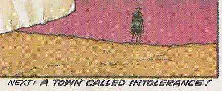
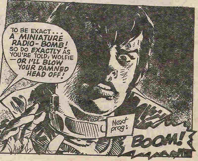
I've already spoken about my love for the 'next prog' boxes (sadly still not great at the moment, Tharg, if you're reading). These, too, are a distinctive feature of serialized stories in all contexts. Comics have the advantage of being able to embellish a 'next week' caption with art and design as well as the usual cheap pun. I guess TV shows can do their little tricks with sound (as in the Eastenders drumbeats, or 24's ticking clock. WHY OH WHY ISN'T IT A 24-HOUR CLOCK? AAARLGH), but that's what diversity is all about, or something. Anyway, here's Wolfie Smith wearing a bomb-collar...

Thursday, May 03, 2007

2000 AD and the cult of death


Let's keep it simple today. 2000 AD is cool because it shows people being killed a lot. This is unquestionably entertaining. I can't rightly say why, but it is. See?

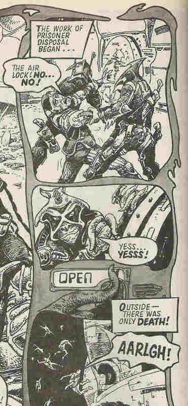
Death can be funny:


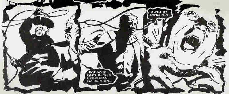
Death can be just:

Death can be horrifying:

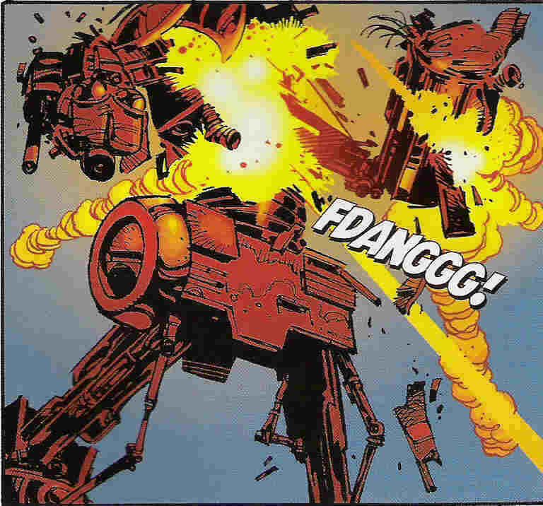
Death can be explosively satisfying: (what, you think robots can't die? Oh yes they can)

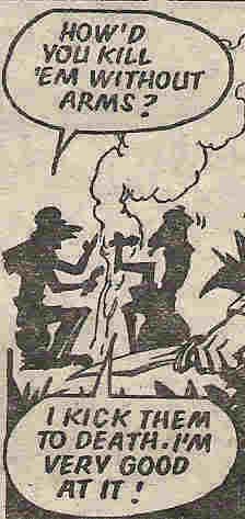
Sometimes it's nice just to talk about death for a bit:


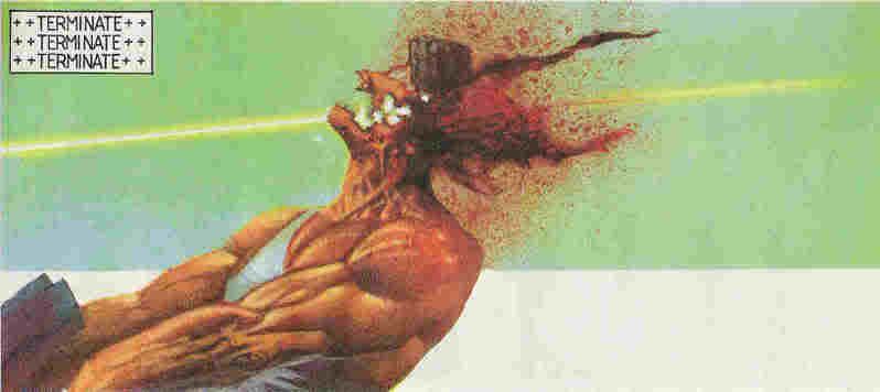
And above all, death can be downright obscene: