The things comics can do
There's no unifying 2000 AD theme as such to this post, but I felt like unleashing another batch of prime panels that show off the unique(ish) abilities of comics, my favourite medium. Of course, it's best to do this kind of thing with help from the master writers, artists - and this time around, letterers - which is where 2000 AD comes in.
Let's start with something simple - the double meaning.
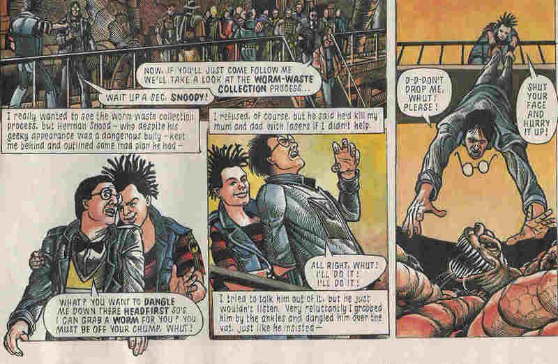
The story here is narrated by one D. Menace (the lad in the black and red jumper). If you have keen eyes or can enlarge the scan somehow, you'll see that the caption boxes tell his account of the events that happened on a school trip to a munce factory. The pictures of course tell a different story. As you can see, W. Softy might take issue with the account in the captions. Obviously this sort of thing has been done in films (most famously Rashomon and I suppose the Usual Suspects does something similar), but there's something uniquely satisfying about seeing the truth and the lie together in the same panel. Anyone who grew up reading British comics will of course also appreciate the use of the Beano's Dennis and Walter to make it eve more transparent what is really going on - straight up bullying.
Here's an artist's trick: use of lines to indicate that something is awry.
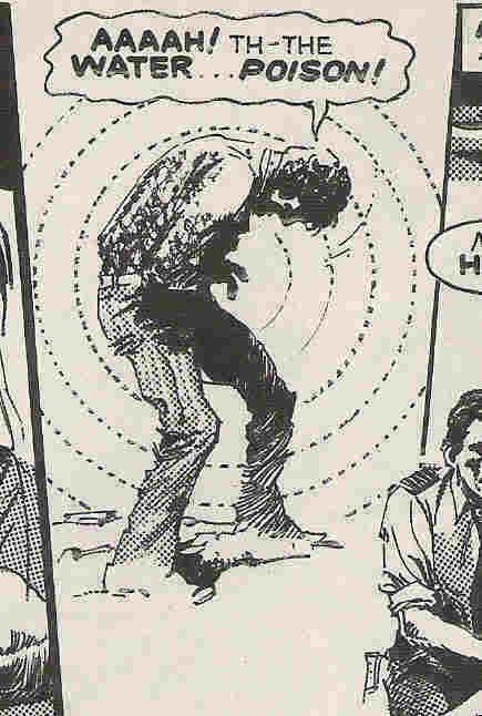
There's probably a technical term for this but I'm blowed if I know it. I guess this again has a filmic equivalent - using a shaky camera to denote drunkenness or that comedy fisheye lens bit from the peyote sequence in Young Guns. I think it looks way cool in this 70s comic style. It'd be interesting to see if it would work without the explanatory caption, though. Anyway, what do you expect when you drink from a lake on THE PLANET OF THE DAMNED, eh?
Here are two lettering techniques in action:
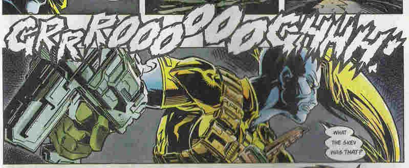
Poor old Venus Bluegenes. Going about her sneaky business when suddenly an awesome growl rips through the panel borders and interrupts her train of stealth. We can see just how disconcerting this is because her speech then follows in three separate balloons. OK, so it's not a groundbreaking technique, but it really works to get across the emotion. It bugs me sometimes when one has to re-read a balloon several times to work out all the nuances of emphasis. Although it bugs me more when some letterers/writers/editors (whoever it is that makes the final decision) put some key words in italics to help with this, but then pick the wrong words. Grooh.
This one's fun - use of space. A trick known to fins artists since at least the Renaissance and probably since chalk was discovered, it still works a treat.

In comics, of course, a canny artist will use this kind of room to carry the readers eye around the page, as well as to service the emotion. There is a certain amount of backstory to add to the despair evident in this bleak, black panel. Novice Strontium Dog Feral has recently learned that he is not just a mutant, he is also the son of a demon. A particularly nasty demon. The same demon, in fact, who killed his mentor and much-mourned friend (actually they mostly fought and bitched at each other) Johnny Alpha. And in order to find out what the Hell this all means, Feral has just killed himself with the intention of journeying to the lowest pits of said Hell to find his now dead Demon father. Mmmmm bleak. Which is one reason it always bugged me that Nigel Dobbyn was the artist for this series. He's great at soap opera and cuddly stuff (who didn't love Medivac 318? No, really, it's way better than Mercy Heights), but not so great with the horrific mutation business. Still, he came up trumps with this panel. The emotions will be cranked up another level when Feral meets Alpha in Hell...
Another film classic next - the montage. Once again, comics has a necessarily different approach in that a) there is no stomping 80s power ballad to guide you through the scene, and b) you can see all the action on one page. Anyway, here's the mighty Flint showing what it would look like if a horde of Judges go on a spree of arrests in order to root out Total War terrorists.
 Flint's awesome, isn't he? Dig the way he uses some panel borders as a time-gap device, and others to frame different parts of the city all on the same page. Groovy.
Of course, one of the all time great comics artists cut his teeth on Judge Dredd as well. That'd be Brian Bolland. Sometimes I found his strip work a bit tiring to read, since he puts so much into every panel. Frankly it s a good thing people can only afford to use him as a cover artist these days. Anyone familiar with his run of Animal Man covers in particular will know that Bolland isn't afraid to use the comics page and art style to be cool and weird at the same time.
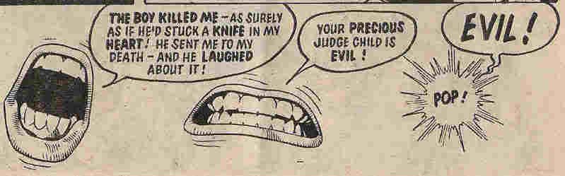
This sequence from the Judge Child Quest is astonishing for the amount of emotional content, as well as narrative, in what is really a very small amount of detail. The H=Judge Child saga as a whole was more than a little disjointed, but the jigsaw disease segment was great fun. I really like the way that the second mouth movement not only fits the words spoken, but also looks as if that's the contortion that a mouth goes through when it's about to disappear.
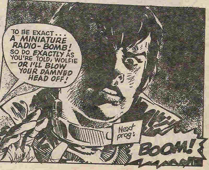
I've already spoken about my love for the 'next prog' boxes (sadly still not great at the moment, Tharg, if you're reading). These, too, are a distinctive feature of serialized stories in all contexts. Comics have the advantage of being able to embellish a 'next week' caption with art and design as well as the usual cheap pun. I guess TV shows can do their little tricks with sound (as in the Eastenders drumbeats, or 24's ticking clock. WHY OH WHY ISN'T IT A 24-HOUR CLOCK? AAARLGH), but that's what diversity is all about, or something. Anyway, here's Wolfie Smith wearing a bomb-collar...
Let's start with something simple - the double meaning.
The story here is narrated by one D. Menace (the lad in the black and red jumper). If you have keen eyes or can enlarge the scan somehow, you'll see that the caption boxes tell his account of the events that happened on a school trip to a munce factory. The pictures of course tell a different story. As you can see, W. Softy might take issue with the account in the captions. Obviously this sort of thing has been done in films (most famously Rashomon and I suppose the Usual Suspects does something similar), but there's something uniquely satisfying about seeing the truth and the lie together in the same panel. Anyone who grew up reading British comics will of course also appreciate the use of the Beano's Dennis and Walter to make it eve more transparent what is really going on - straight up bullying.
Here's an artist's trick: use of lines to indicate that something is awry.
There's probably a technical term for this but I'm blowed if I know it. I guess this again has a filmic equivalent - using a shaky camera to denote drunkenness or that comedy fisheye lens bit from the peyote sequence in Young Guns. I think it looks way cool in this 70s comic style. It'd be interesting to see if it would work without the explanatory caption, though. Anyway, what do you expect when you drink from a lake on THE PLANET OF THE DAMNED, eh?
Here are two lettering techniques in action:
Poor old Venus Bluegenes. Going about her sneaky business when suddenly an awesome growl rips through the panel borders and interrupts her train of stealth. We can see just how disconcerting this is because her speech then follows in three separate balloons. OK, so it's not a groundbreaking technique, but it really works to get across the emotion. It bugs me sometimes when one has to re-read a balloon several times to work out all the nuances of emphasis. Although it bugs me more when some letterers/writers/editors (whoever it is that makes the final decision) put some key words in italics to help with this, but then pick the wrong words. Grooh.
This one's fun - use of space. A trick known to fins artists since at least the Renaissance and probably since chalk was discovered, it still works a treat.
In comics, of course, a canny artist will use this kind of room to carry the readers eye around the page, as well as to service the emotion. There is a certain amount of backstory to add to the despair evident in this bleak, black panel. Novice Strontium Dog Feral has recently learned that he is not just a mutant, he is also the son of a demon. A particularly nasty demon. The same demon, in fact, who killed his mentor and much-mourned friend (actually they mostly fought and bitched at each other) Johnny Alpha. And in order to find out what the Hell this all means, Feral has just killed himself with the intention of journeying to the lowest pits of said Hell to find his now dead Demon father. Mmmmm bleak. Which is one reason it always bugged me that Nigel Dobbyn was the artist for this series. He's great at soap opera and cuddly stuff (who didn't love Medivac 318? No, really, it's way better than Mercy Heights), but not so great with the horrific mutation business. Still, he came up trumps with this panel. The emotions will be cranked up another level when Feral meets Alpha in Hell...
Another film classic next - the montage. Once again, comics has a necessarily different approach in that a) there is no stomping 80s power ballad to guide you through the scene, and b) you can see all the action on one page. Anyway, here's the mighty Flint showing what it would look like if a horde of Judges go on a spree of arrests in order to root out Total War terrorists.
Flint's awesome, isn't he? Dig the way he uses some panel borders as a time-gap device, and others to frame different parts of the city all on the same page. Groovy.Of course, one of the all time great comics artists cut his teeth on Judge Dredd as well. That'd be Brian Bolland. Sometimes I found his strip work a bit tiring to read, since he puts so much into every panel. Frankly it s a good thing people can only afford to use him as a cover artist these days. Anyone familiar with his run of Animal Man covers in particular will know that Bolland isn't afraid to use the comics page and art style to be cool and weird at the same time.
This sequence from the Judge Child Quest is astonishing for the amount of emotional content, as well as narrative, in what is really a very small amount of detail. The H=Judge Child saga as a whole was more than a little disjointed, but the jigsaw disease segment was great fun. I really like the way that the second mouth movement not only fits the words spoken, but also looks as if that's the contortion that a mouth goes through when it's about to disappear.
I've already spoken about my love for the 'next prog' boxes (sadly still not great at the moment, Tharg, if you're reading). These, too, are a distinctive feature of serialized stories in all contexts. Comics have the advantage of being able to embellish a 'next week' caption with art and design as well as the usual cheap pun. I guess TV shows can do their little tricks with sound (as in the Eastenders drumbeats, or 24's ticking clock. WHY OH WHY ISN'T IT A 24-HOUR CLOCK? AAARLGH), but that's what diversity is all about, or something. Anyway, here's Wolfie Smith wearing a bomb-collar...
posted by alexf at 15:12
![]()
![]()


0 Comments:
Post a Comment
<< Home