The art of characterisation
So what we have today is a small showcase of a few artists, who have all scored highly on that noblest of 2000 AD scores, attention to detail. For as long as I've been reading 2000 AD, I've also been reading American comics, mostly Marvel with the odd Batman thrown in. I think in the last few years the artwork in superhero books has finally caught up with 2000 AD, although the stories are still a little way behind. Certainly the general atmosphere of subversiveness is that much stronger in Tharg's mighty organ. But for many years, even during the dark late 90s, I always found that 2000 AD had far superior art to its US rivals, in the most part because the artists bothered to actually fill each panel. Sometimes this meant lots of background, sometimes it meant strong characterisation, and sometimes it meant Belardinelli or O'Neill just ramming in incidental weirdness, in a tradition that I can certainly trace back through reading the Beano.
For an introductory paragraph, there's a lot of digression there! What I'm really talking about today is the joy of seeing an artist who is prepared to fully flesh out even the most menial side character in a story. Partly it's the deftness of their touch in bringing to life a face, and partly it's the design of clothes, or hair, or what have you. The whole thing serves to immerse the reader in the situation.
First up, Carlos Ezquerra:
 (from 'Portrait of a Mutant')
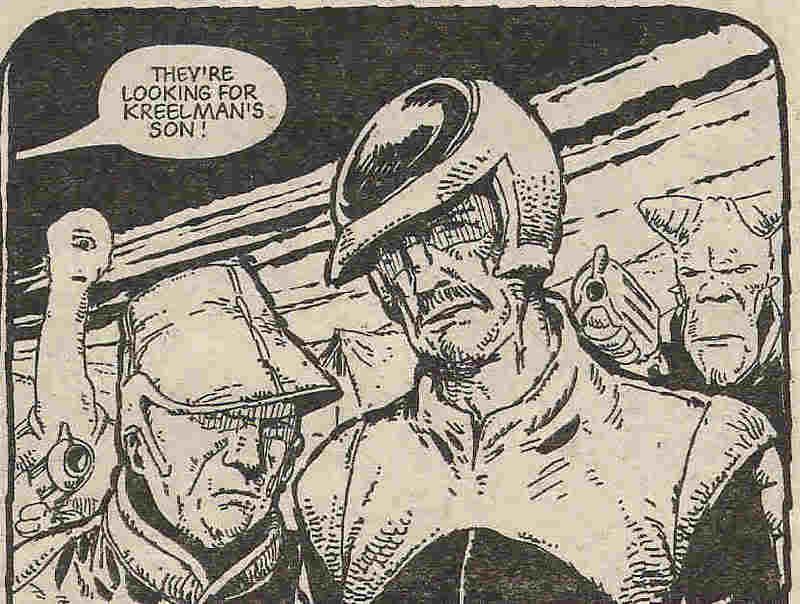
In the foreground, you've got two fairly random humes, who're looking for Johnny Alpha. They're as minor as can be. But from this picture alone, you can tell that they're a)lackeys, but b) competent lackeys. There's an air to them of wanting to complete their mission, an enough nous to see through a few lies - but not enough menace to make them full-on villains.
And then in the background you've got a couple of random mutants. Ezquerra drew some awesome mutants, some seen once and never again.
Jumping to the modern era, here's some Clint Langley Slaine-y goodness:
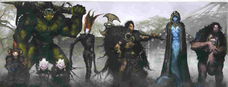
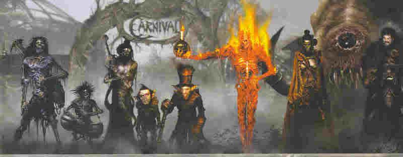
Now, this is a panel designed to introduce new characters, so you'd expect a good level of detail, but really this goes a step above, especially when you consider that several of these characters won't feature all that often. But what gets me is how seamlessly Langley blends his photo work with his artwork. Obviously he's been much praised for this before and since, but I think Carnival was perhaps his best go around on this. I should perhaps talk through the two panels here, but I'd rather just let you click on them, enlarge them, and drink them in...
Now back to mid-period 2000 AD, and another two stalwarts of the comic:
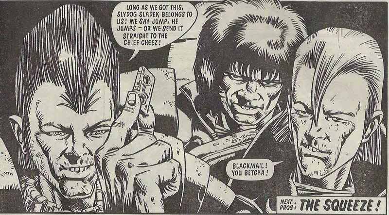
Cam Kennedy, with three Mega-City juves, each oozing their won special delinquencies.
And finally Ian Gibson, with two rows of soldiers (including one rather disgusted Halo Jones), each with their own attitude:

Attention to detail - it's what elevates a great comic from the rest.
For an introductory paragraph, there's a lot of digression there! What I'm really talking about today is the joy of seeing an artist who is prepared to fully flesh out even the most menial side character in a story. Partly it's the deftness of their touch in bringing to life a face, and partly it's the design of clothes, or hair, or what have you. The whole thing serves to immerse the reader in the situation.
First up, Carlos Ezquerra:
 (from 'Portrait of a Mutant')
In the foreground, you've got two fairly random humes, who're looking for Johnny Alpha. They're as minor as can be. But from this picture alone, you can tell that they're a)lackeys, but b) competent lackeys. There's an air to them of wanting to complete their mission, an enough nous to see through a few lies - but not enough menace to make them full-on villains.
And then in the background you've got a couple of random mutants. Ezquerra drew some awesome mutants, some seen once and never again.
Jumping to the modern era, here's some Clint Langley Slaine-y goodness:


Now, this is a panel designed to introduce new characters, so you'd expect a good level of detail, but really this goes a step above, especially when you consider that several of these characters won't feature all that often. But what gets me is how seamlessly Langley blends his photo work with his artwork. Obviously he's been much praised for this before and since, but I think Carnival was perhaps his best go around on this. I should perhaps talk through the two panels here, but I'd rather just let you click on them, enlarge them, and drink them in...
Now back to mid-period 2000 AD, and another two stalwarts of the comic:
Cam Kennedy, with three Mega-City juves, each oozing their won special delinquencies.

And finally Ian Gibson, with two rows of soldiers (including one rather disgusted Halo Jones), each with their own attitude:

Attention to detail - it's what elevates a great comic from the rest.


0 Comments:
Post a Comment
<< Home